Basalt Innovation Quality & Research
Physiapp voor tieners
On behalf of Basalt Innovation Quality & Research, I had the opportunity to redesign the patient application of Physitrack: PhysiApp, specifically for teenagers. The goal of this redesign was to improve the usability of the application and reduce the dropout rate among the target audience. This would enable the app to be widely adopted within pediatric rehabilitation.
Problem Statement
Currently, Basalt uses the Physitrack application, but it does not adequately meet the needs of its target audience: children aged 13 to 18. Basalt has observed that teenagers disengage from using the application, resulting in a lack of follow-through with their treatment at home. Consequently, this negatively impacts the overall effectiveness of their treatment.
Objective
The objective is to make the Physitrack application more appealing and engaging for teenagers. This aims to increase usage of the application and reduce the likelihood of the target audience disengaging.
Team
- Interaction Designer (myself)
- Pediatric Physiotherapist
Duration
Total of 20 weeks
- Look & Listen: 6 weeks
- Create Concept: 4 weeks
- Design Detail: 6 weeks
- Make it real: 4 weeks
Tools
- Balemiq
- Sketch
- Miro
- Figma
- Lookback.io
My Design Process
Look & Listen
In the initial phase of this project, I started with the Look and Listen phase. I began by observing users as they interacted with the application to analyze their behavior while using PhysiApp.
Next, I conducted interviews with the target audience. These interviews allowed me to gain deeper insights into the users by gathering their opinions, behaviors, attitudes, and experiences. These findings helped me develop a clearer understanding of the users' needs and perspectives.
Personas
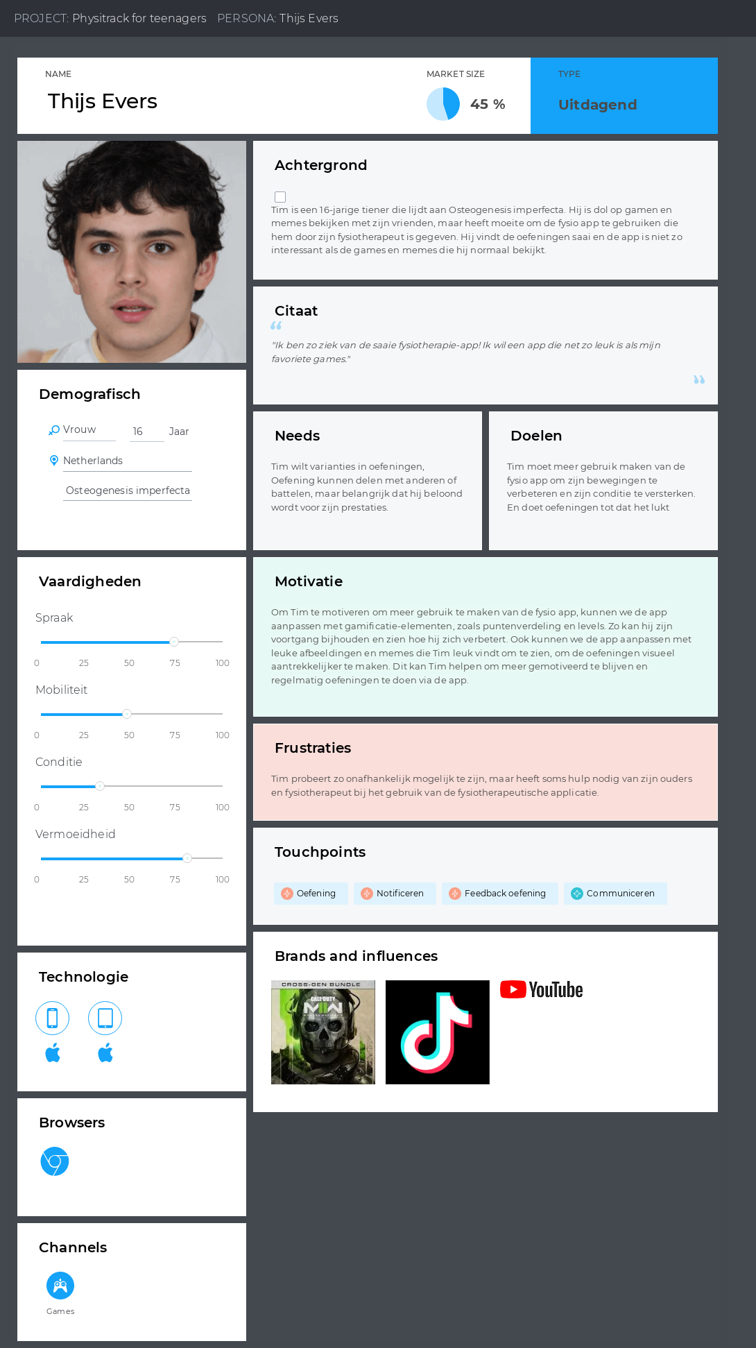
To gain a deeper understanding of the users' goals, needs, experiences, and behaviors, I created three personas representing each of our user segments. These personas were developed based on observations of users interacting with the application and insights gathered during interviews with them.
Customer Journey
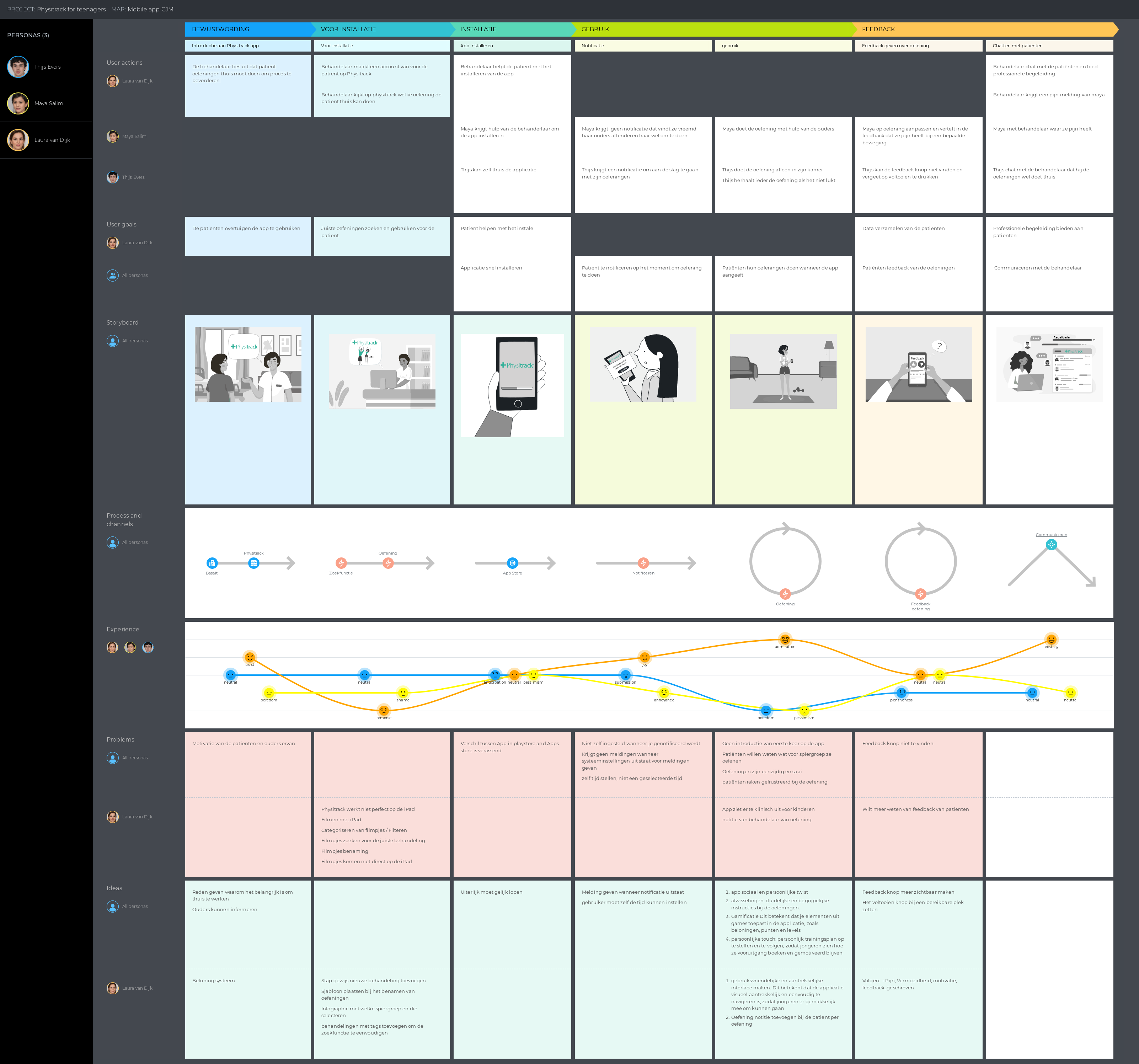
I created a customer journey map to visualize the user experience across various interaction points. This map helped me gain a better understanding of the user experience and identify both the pain points and opportunities within the existing process.
Key challenges faced by the target audience included:
- Receiving occasional reminders but still forgetting to use the app.
- Exercises being perceived as boring and monotonous.
- A lack of challenge, insight, and sense of autonomy.
Create Concepts
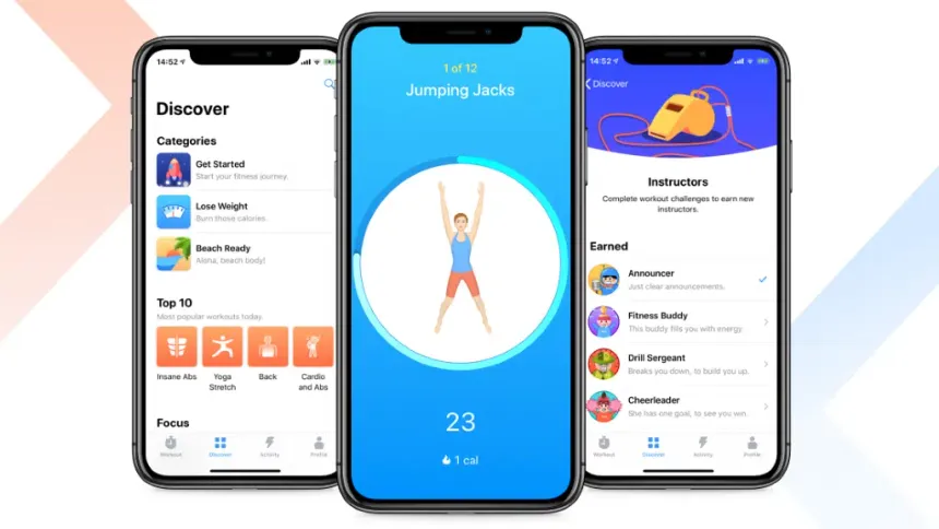
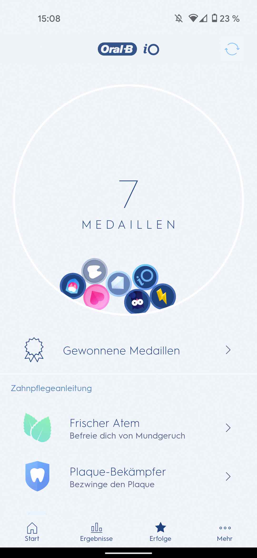
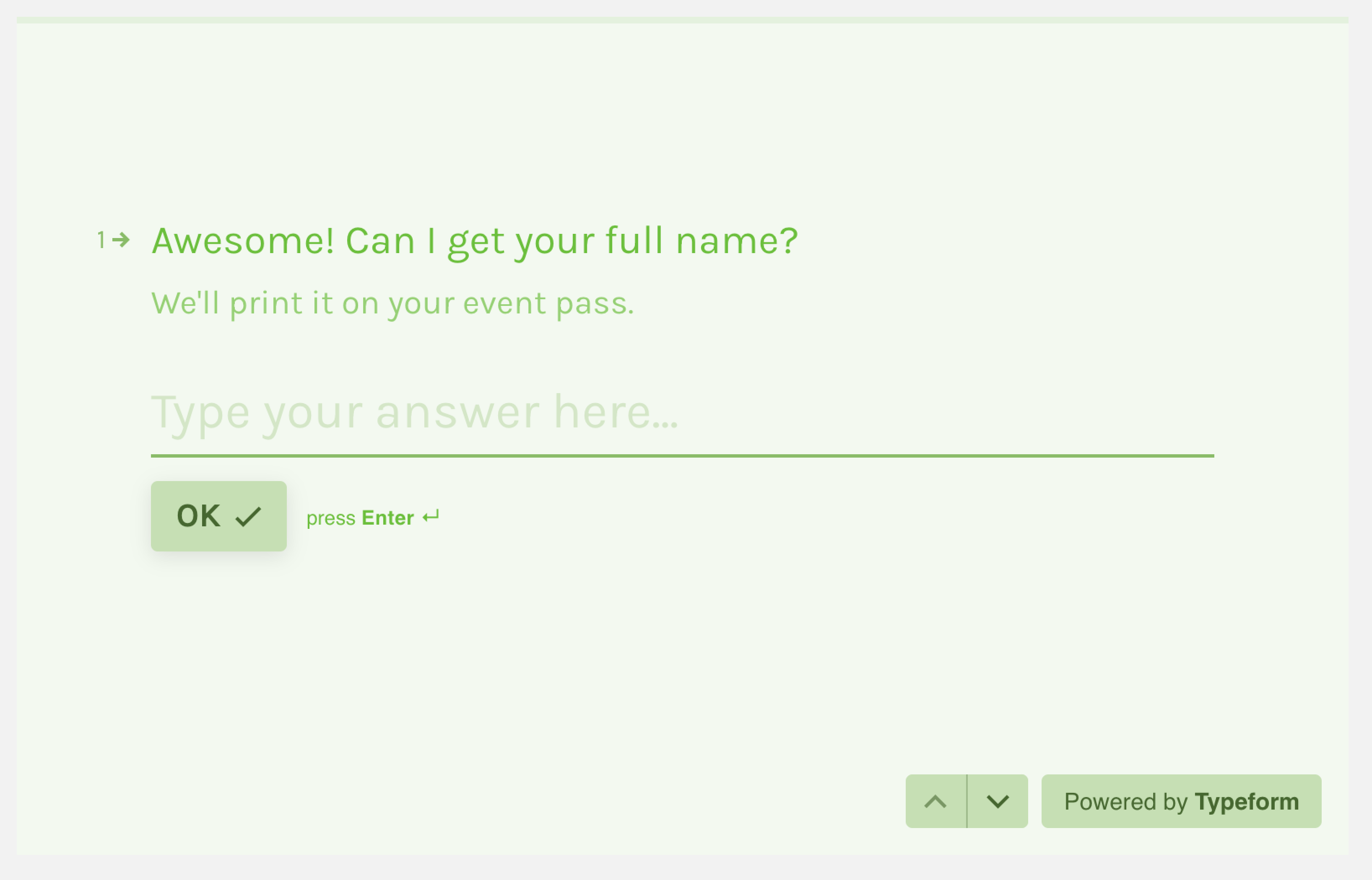
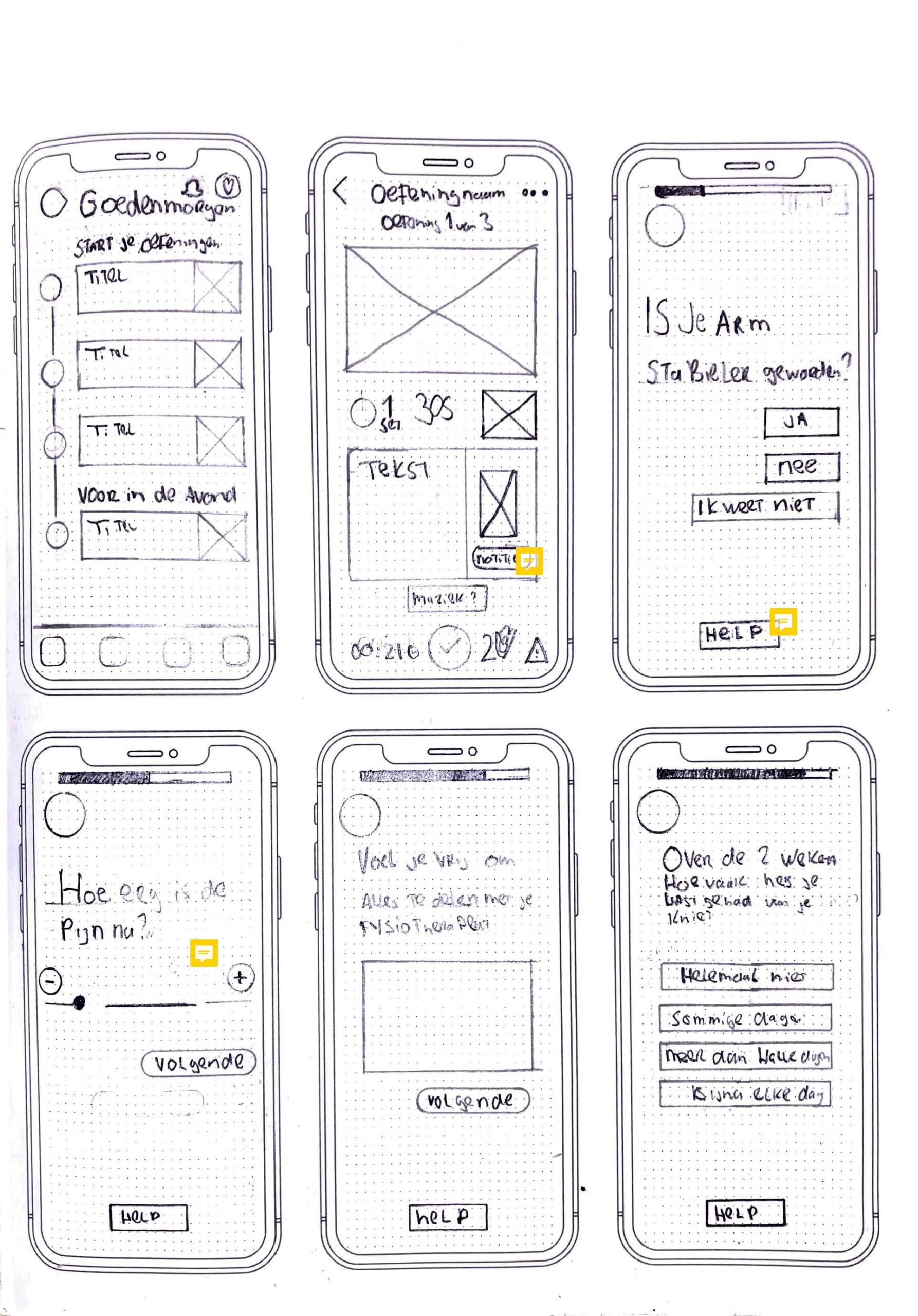
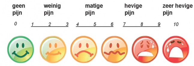
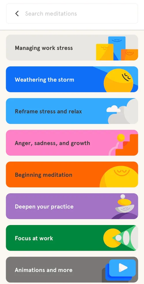
To develop a solid concept, I conducted a co-creation session with the target audience. During this session, I presented various example elements from different apps that they expressed interest in incorporating into PhysiApp. Together, we created a rough sketch, which was then refined into final drafts.
I received feedback from the client on these final drafts, which I subsequently incorporated into the wireframes for the next phase of the project.
Storyboard
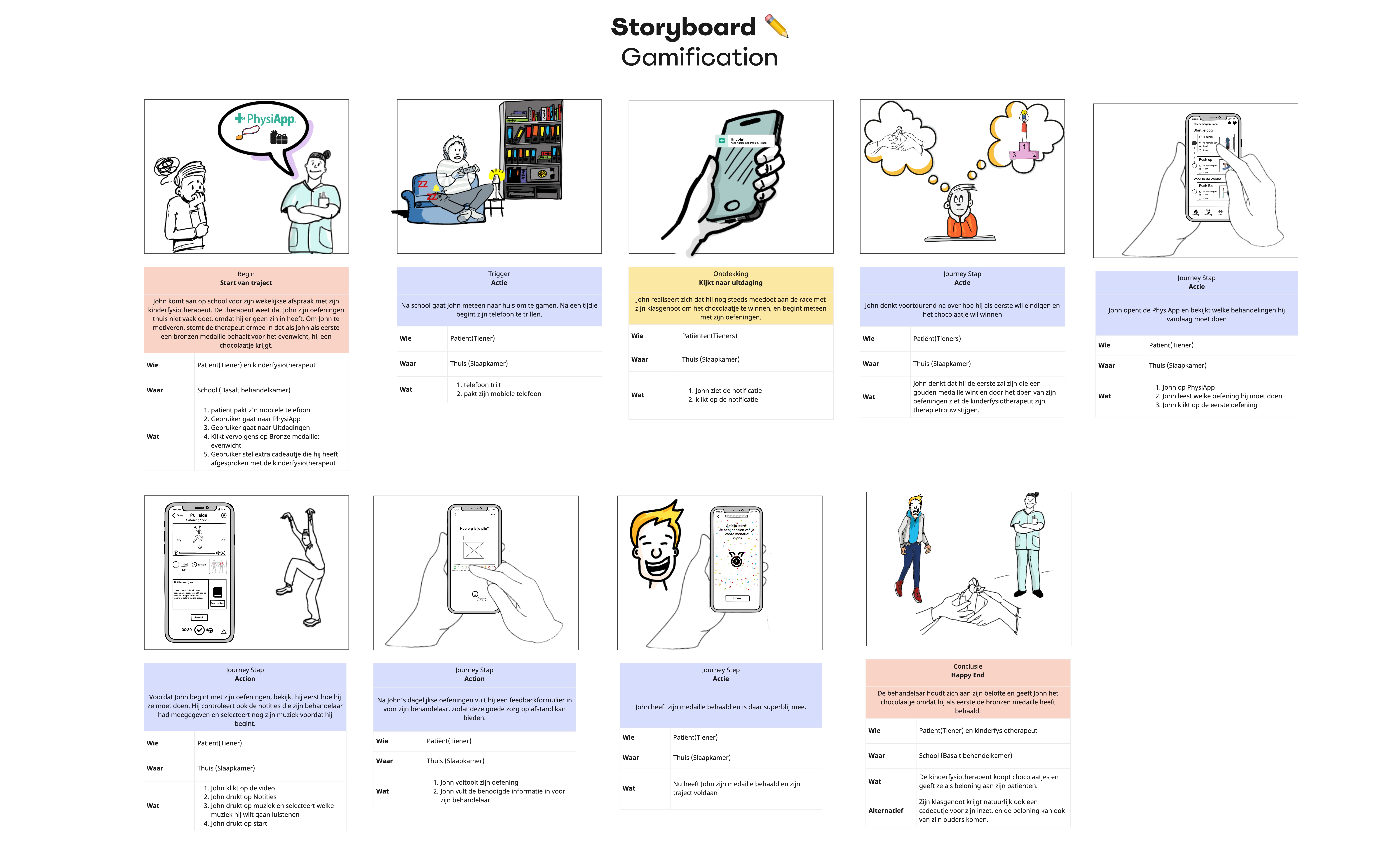
To translate the concept vision into a realistic use case, I created a storyboard based on two typical teen scenarios. This helped visualize how PhysiApp could fit into their daily life not just as a medical tool, but as a motivating, personal companion.
Story 1: Friendly Competition
- John visits his therapist at school and learns he can win a chocolate reward by earning a bronze medal.
- After school, a phone notification reminds him of the challenge.
- He opens PhysiApp, reviews his exercises, selects his music, and starts his workout.
- He completes the exercises, gives feedback, and earns the medal.
- His therapist keeps the promise and rewards him with chocolate.
Story 2: Weekend Motivation - On a boring weekend, John gets a cheerful notification from PhysiApp.
- He remembers his therapist’s advice and decides to do extra exercises.
- He chooses a leg workout, watches the instructions, and starts with music playing.
- After completing it, he fills out feedback and earns a medal.
- The therapist is happy to see John's motivation growing.

Design Details
Based on the insights from interviews, co-creation, and behavioral observations, I made several key design decisions to support teen users throughout their rehabilitation experience.
Key Design Decisions
- Clear structure and flow: Step-by-step navigation helps reduce confusion and supports focus.
- Accessible exercise previews: Teens can view instructions, therapist notes, and choose music before starting.
- Motivating visuals: Elements like medals, reminders, and progress tracking make the experience feel rewarding.
- Built-in feedback: Users are prompted to share how they feel after completing their exercises, helping therapists stay informed.
Wireframes
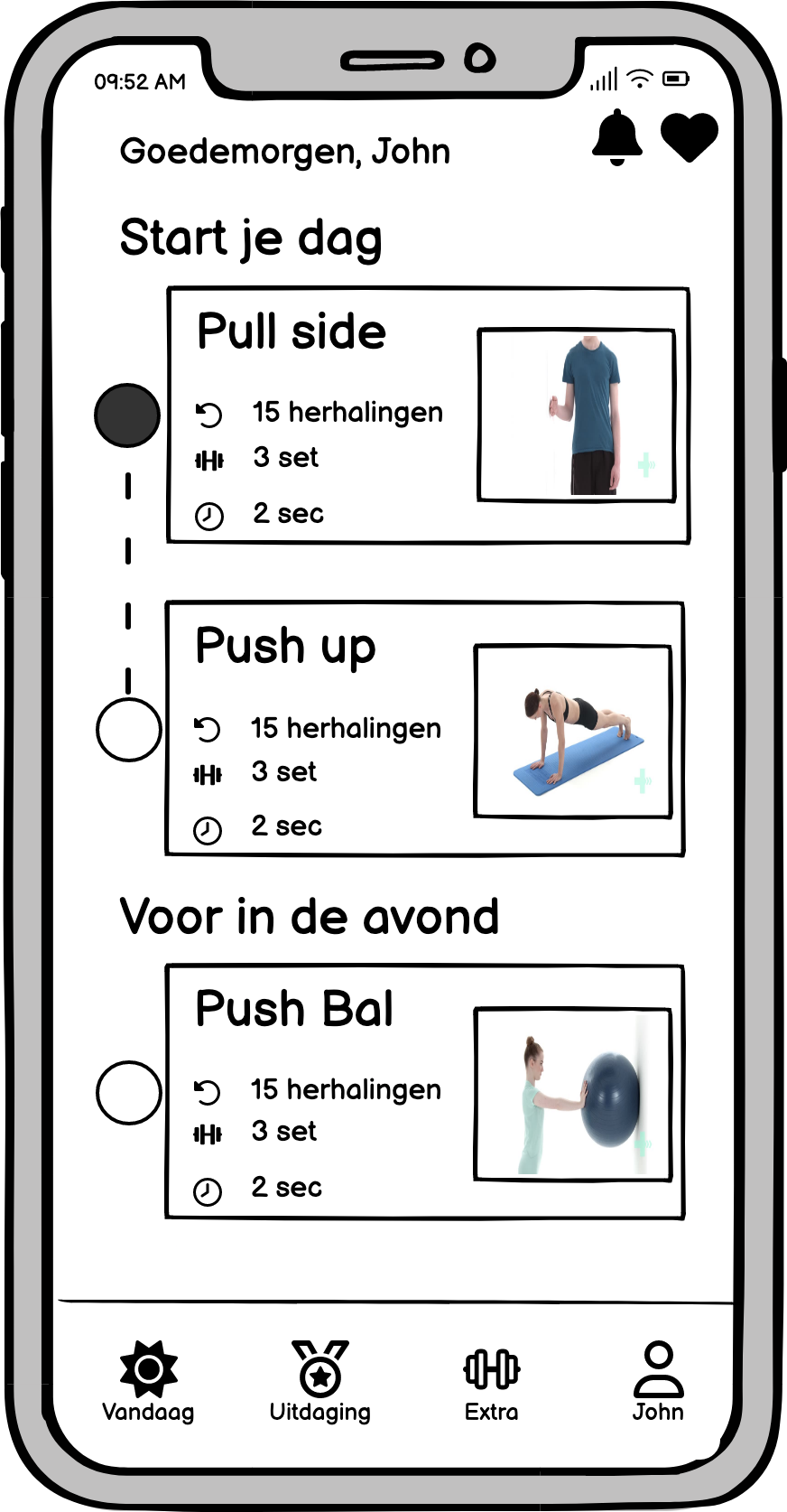
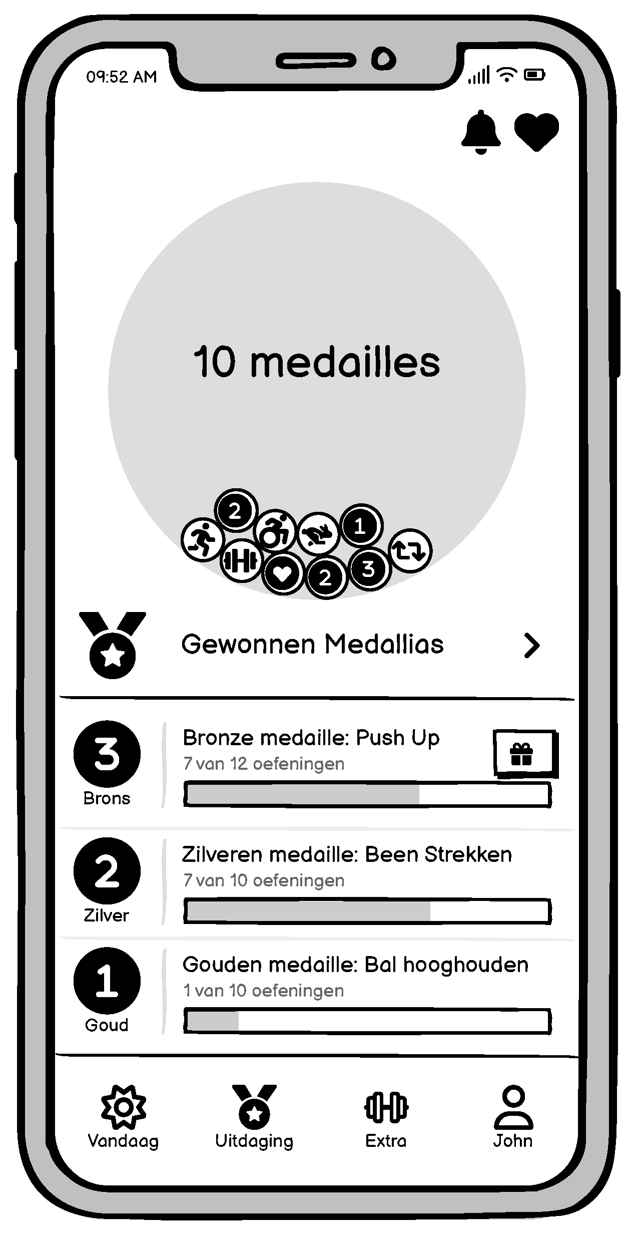
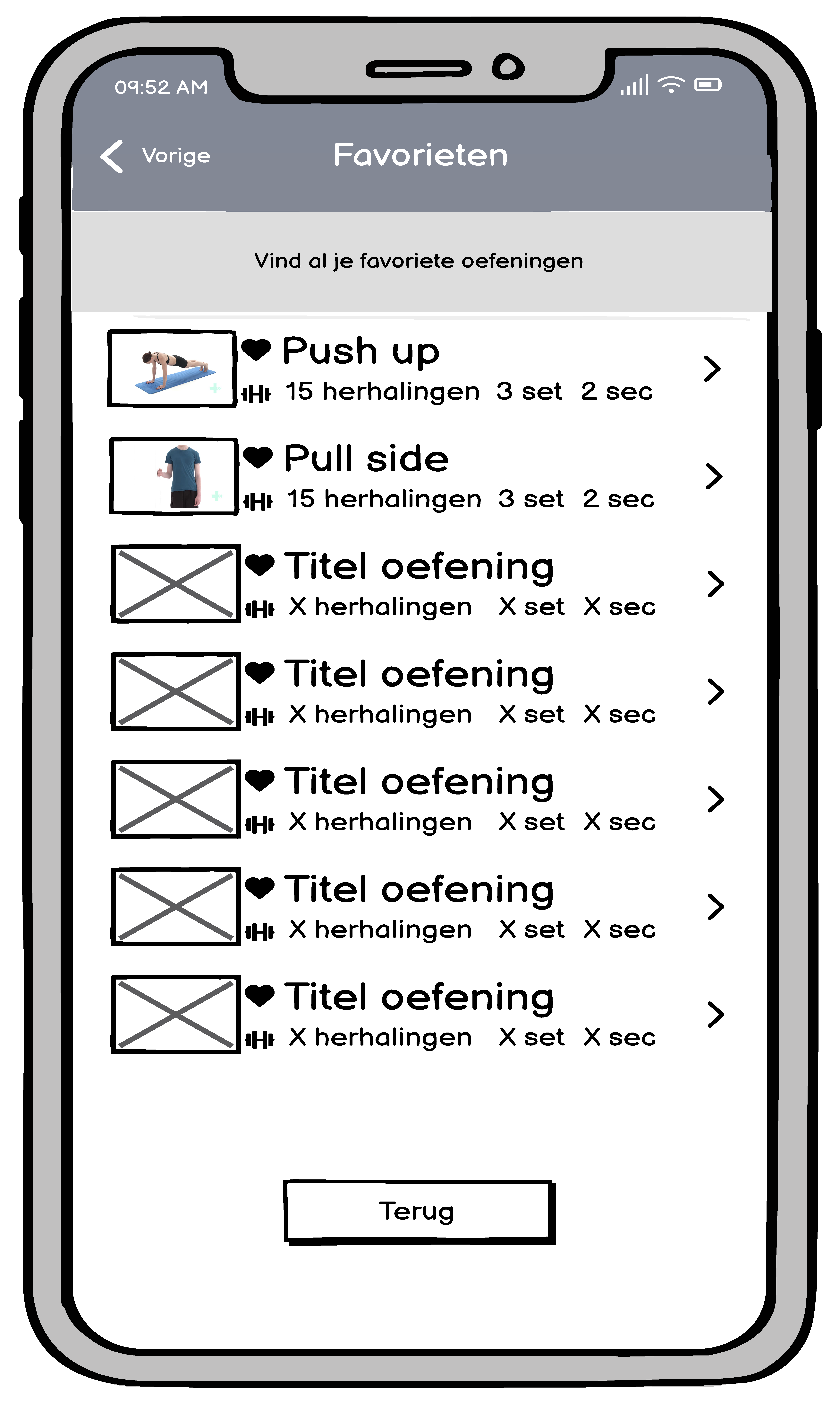
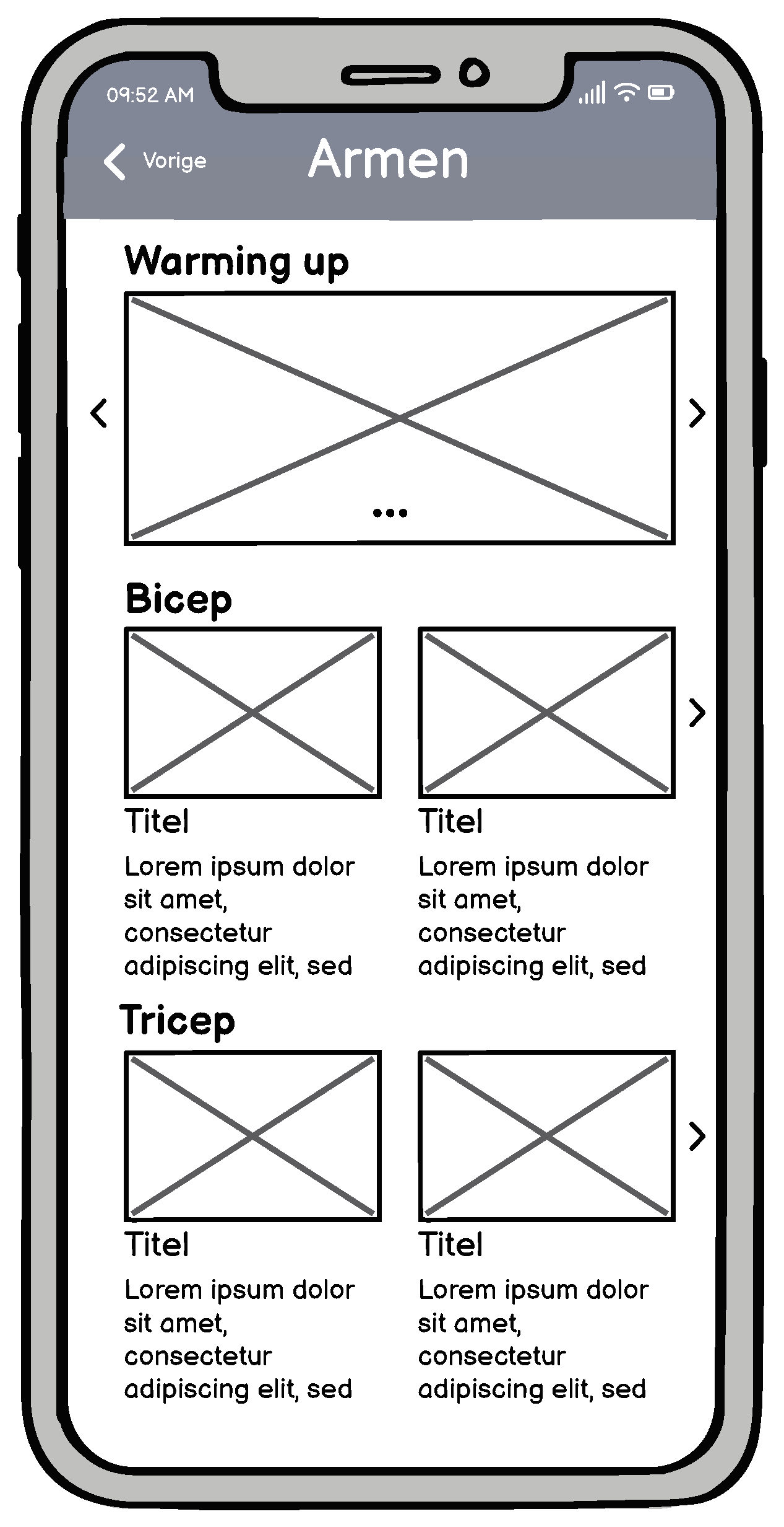
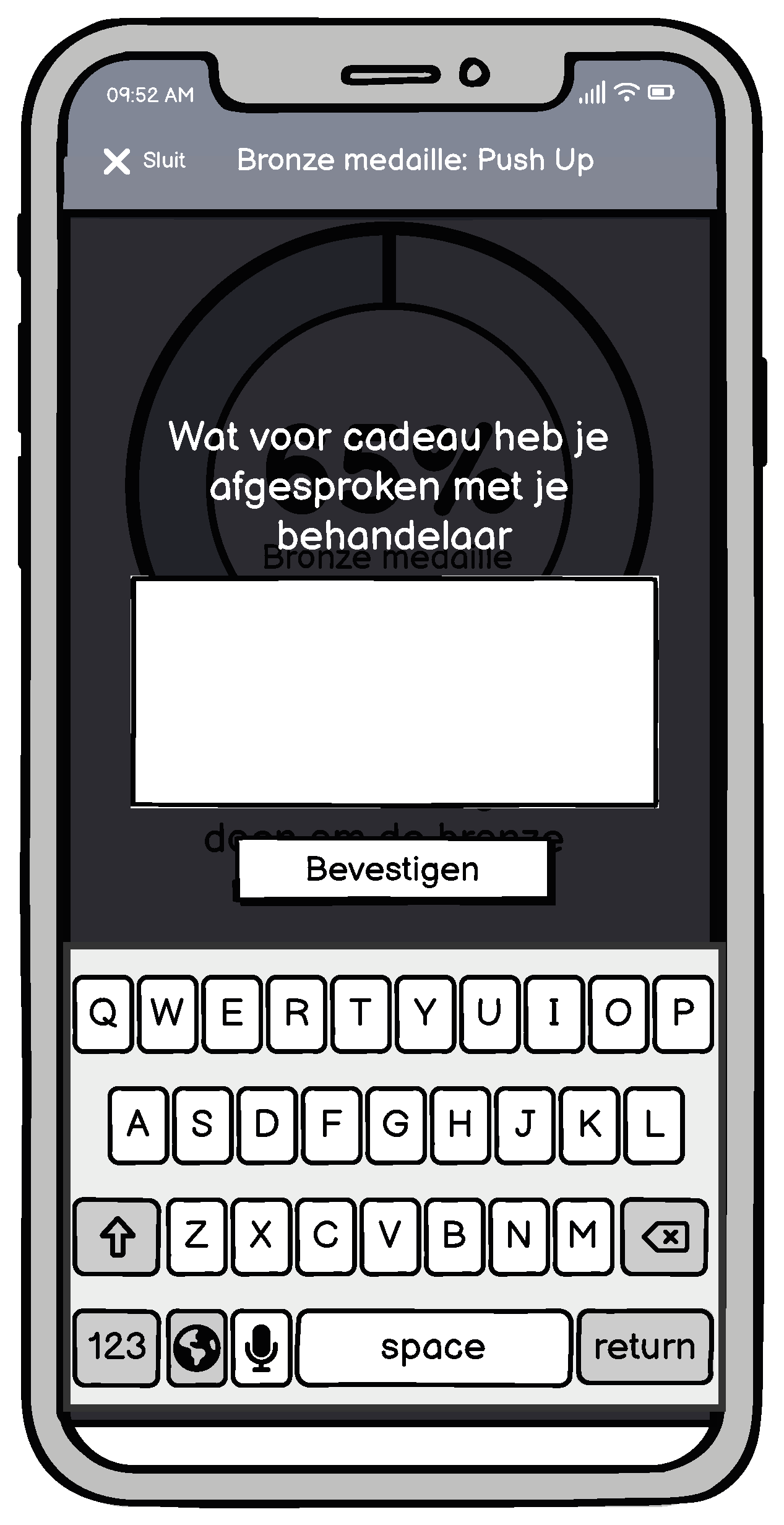
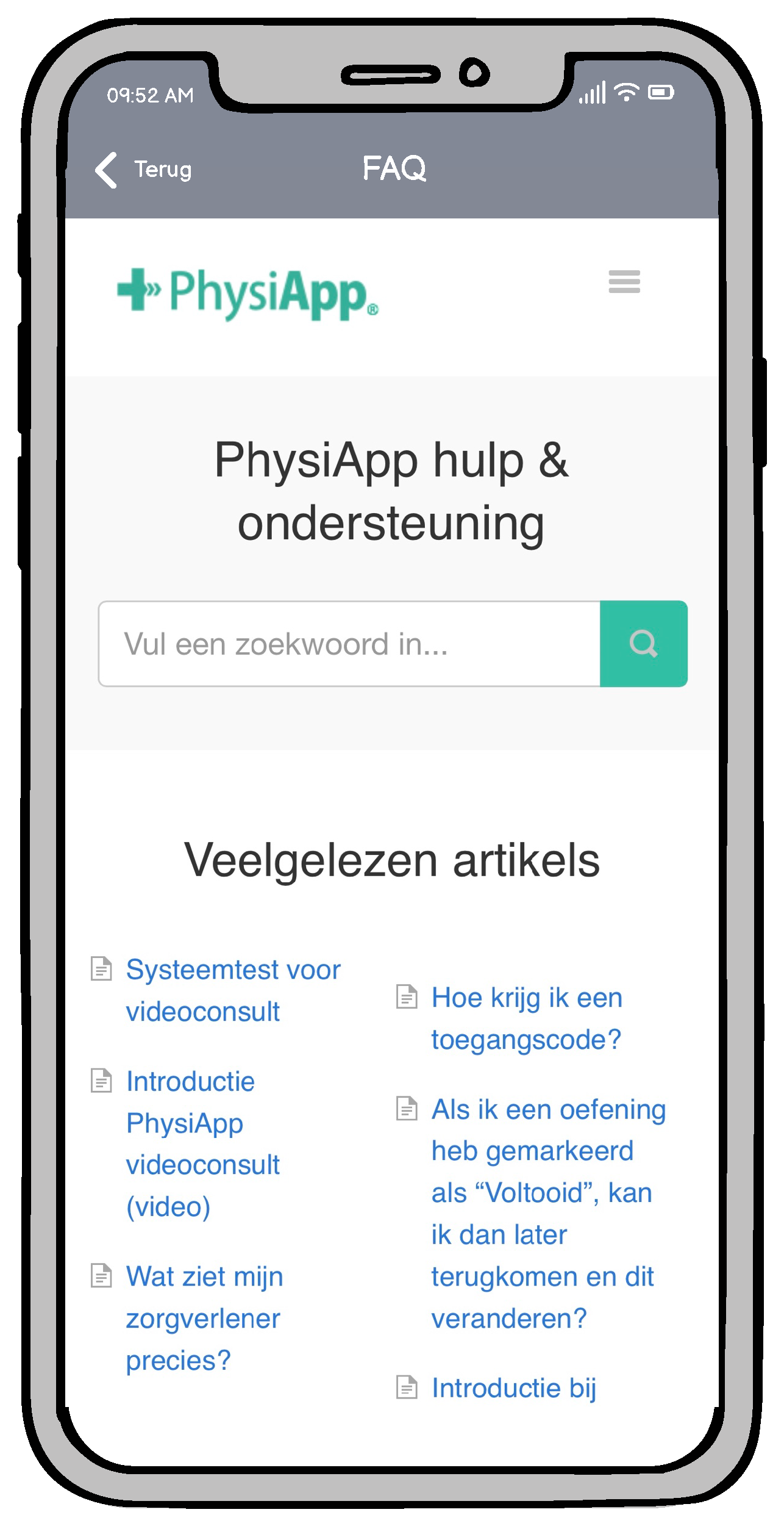
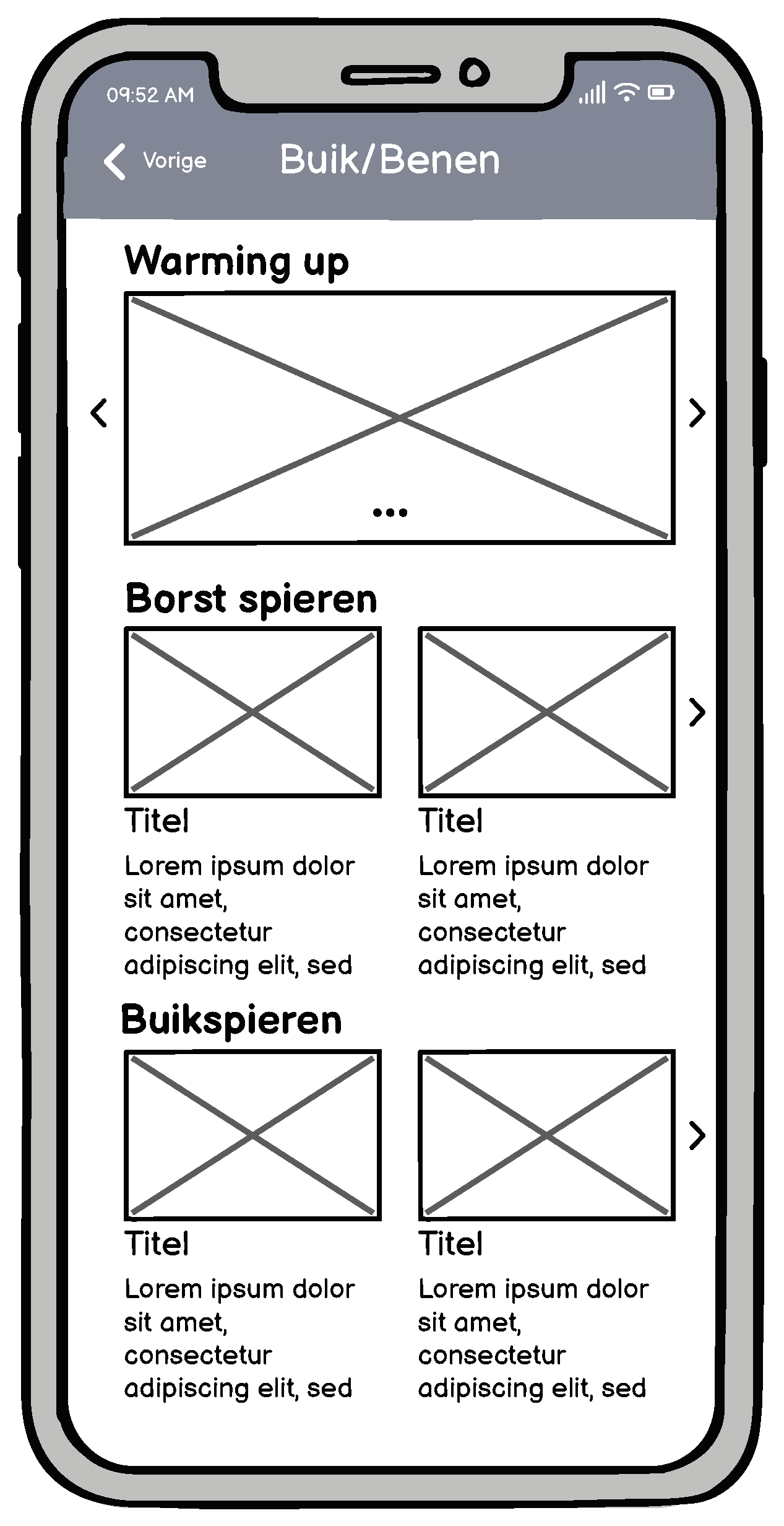
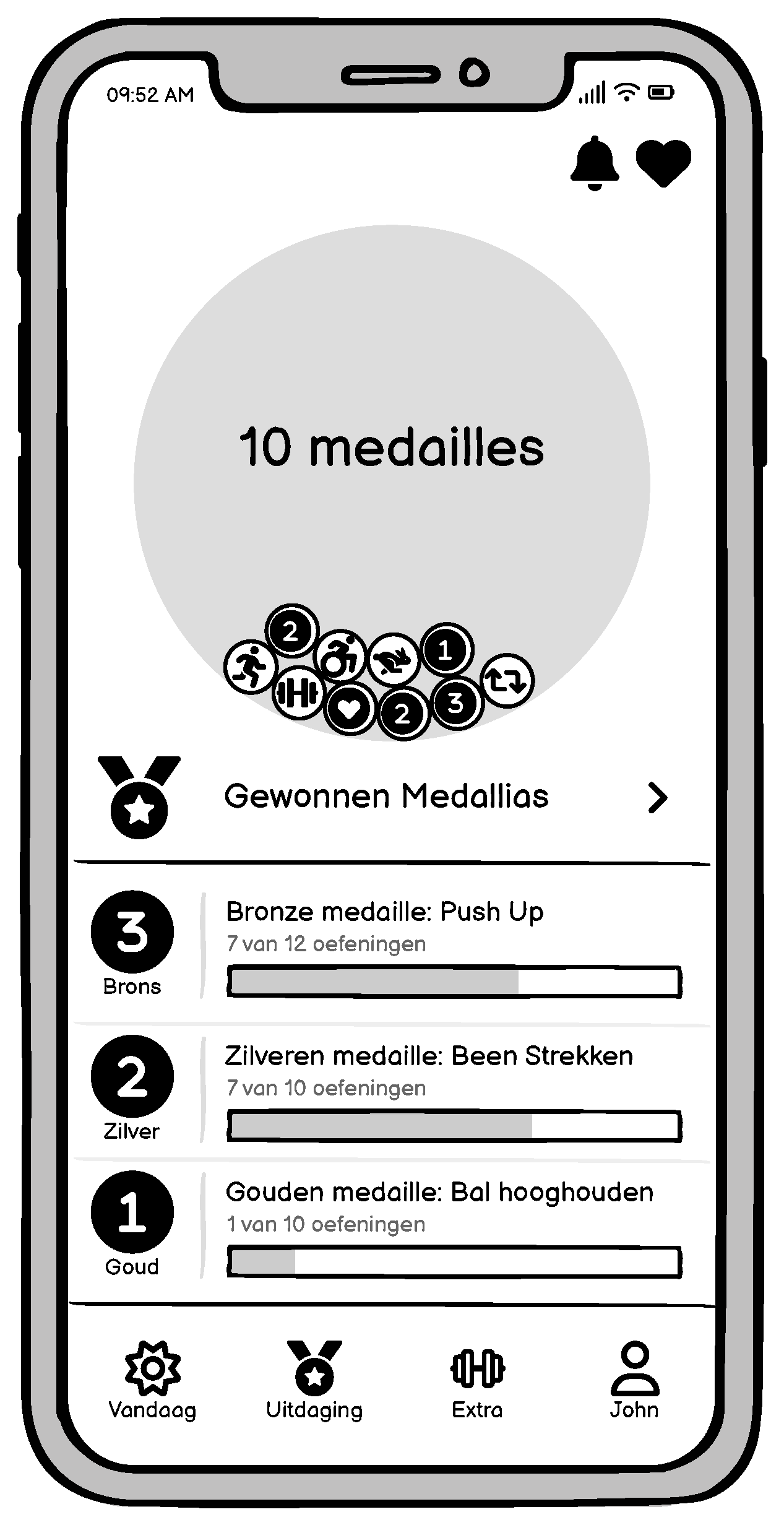
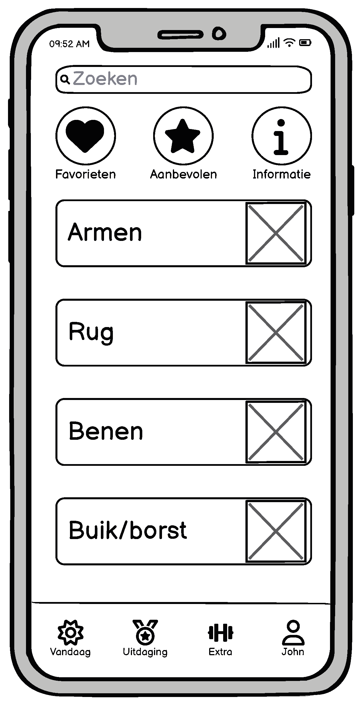
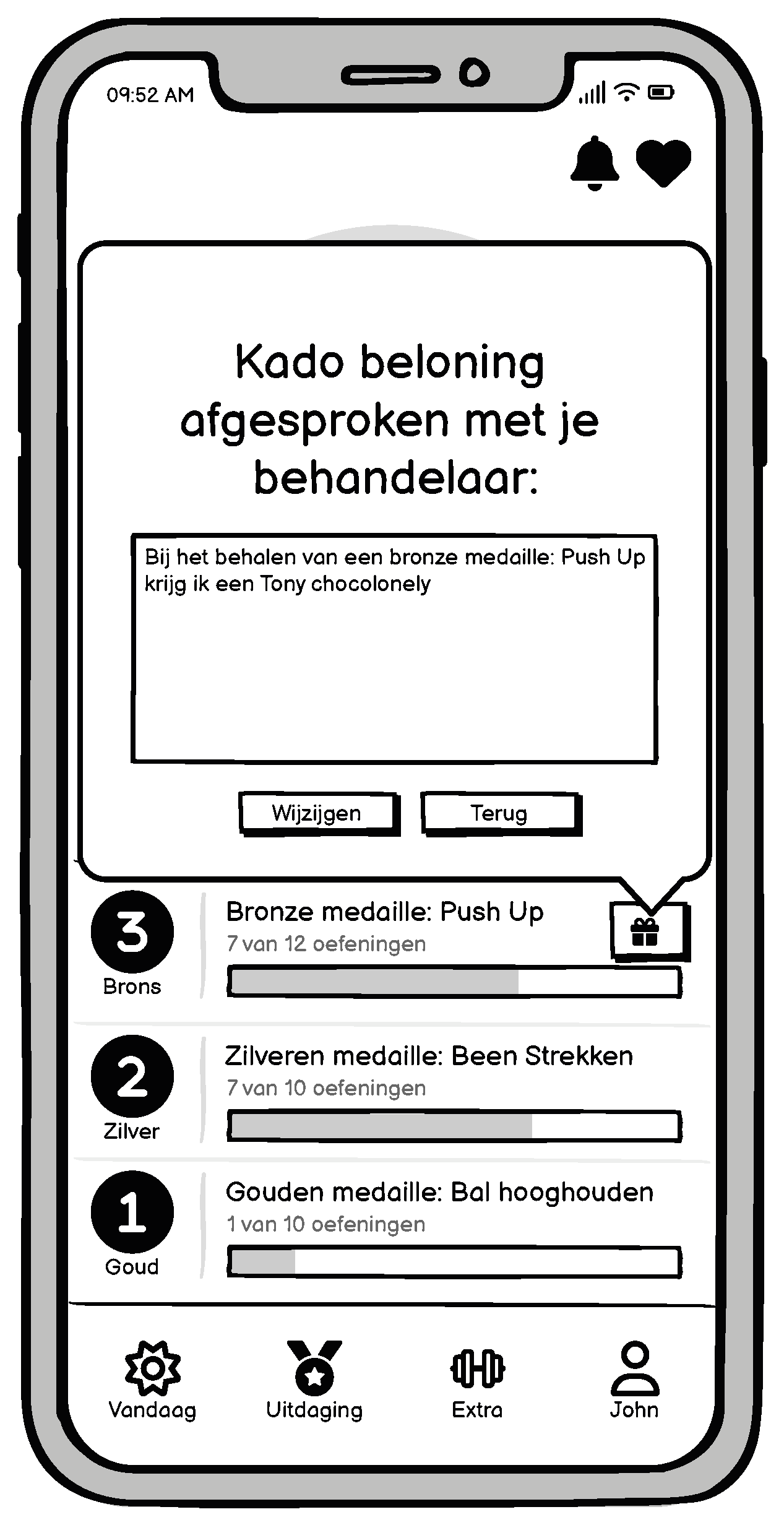
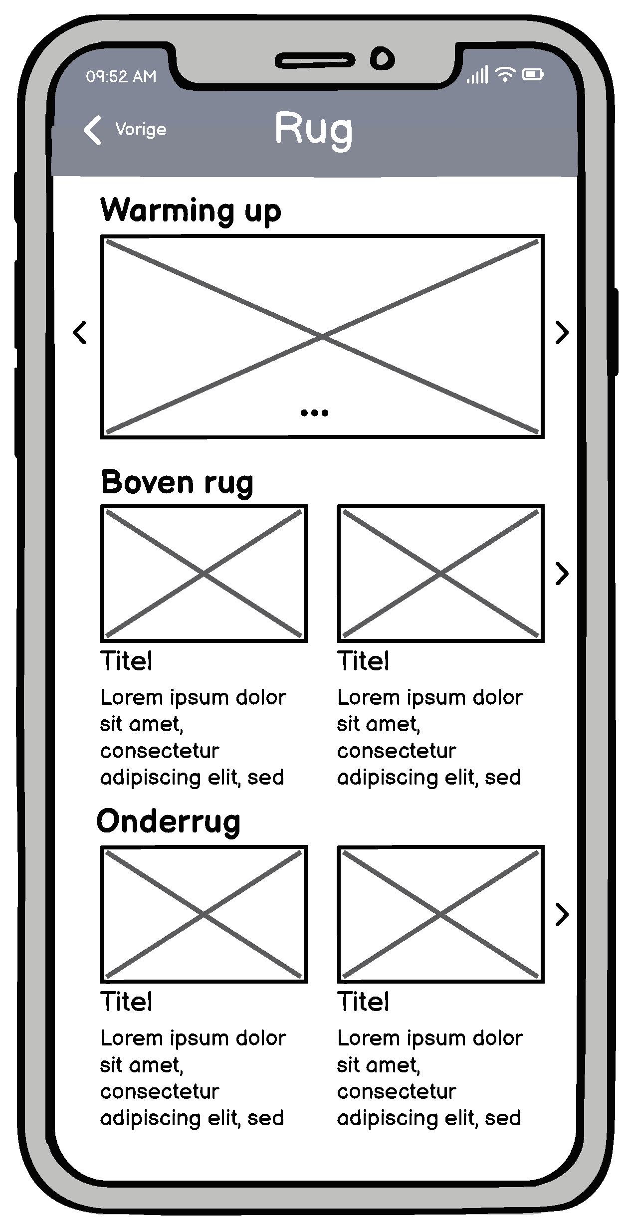
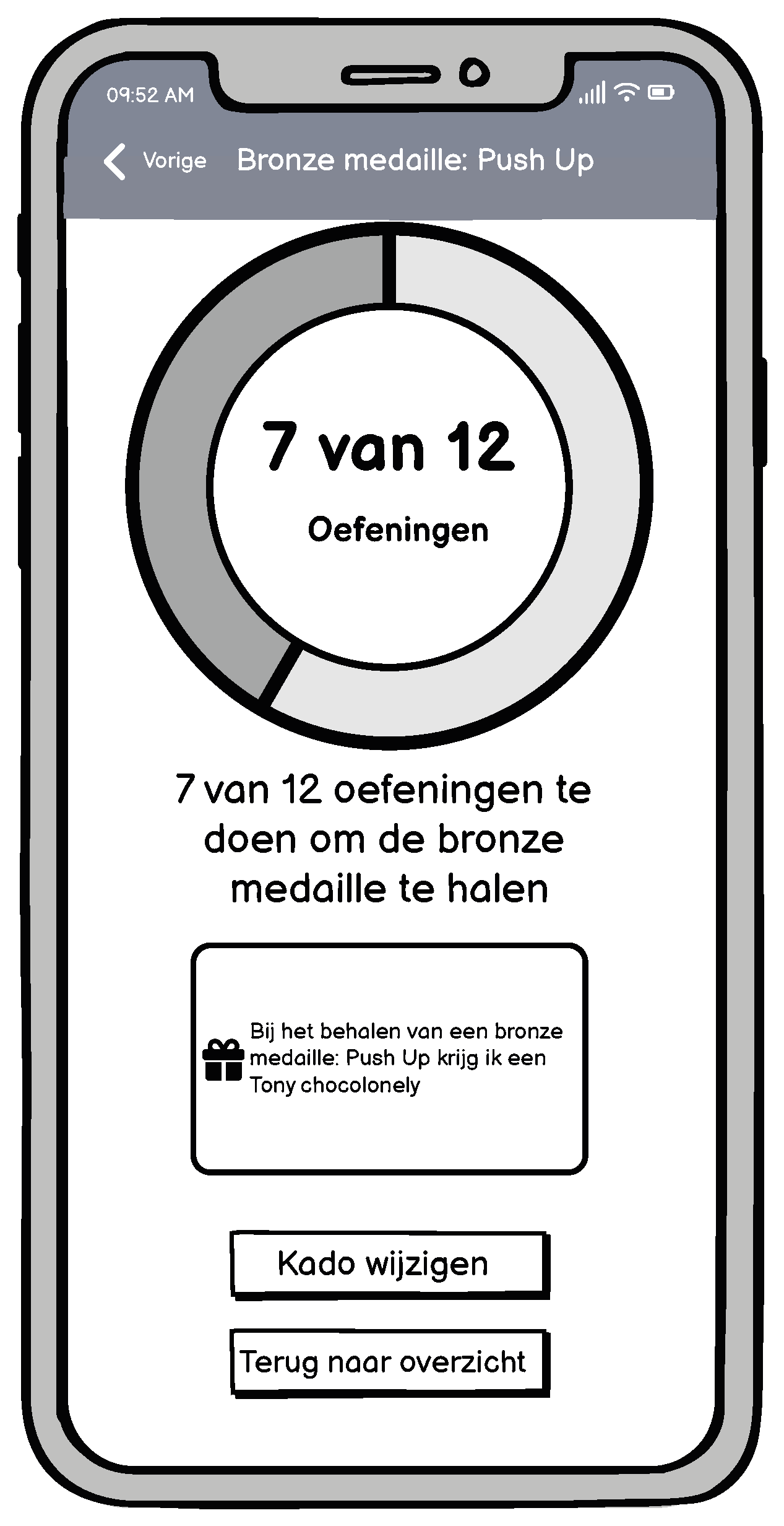
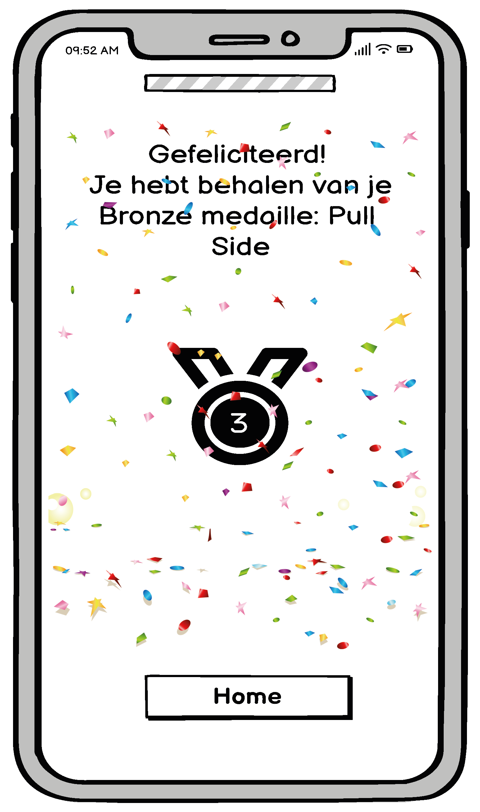
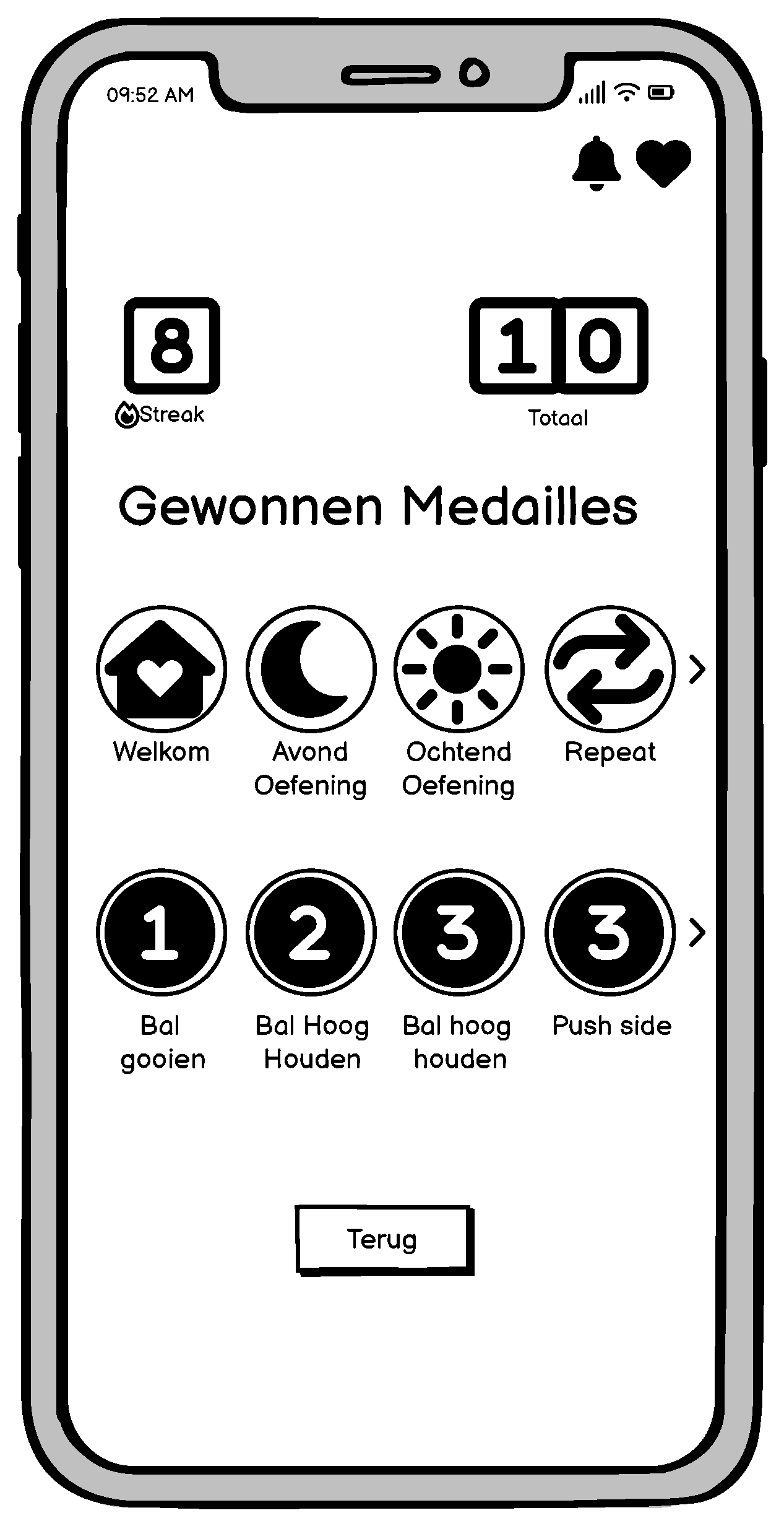
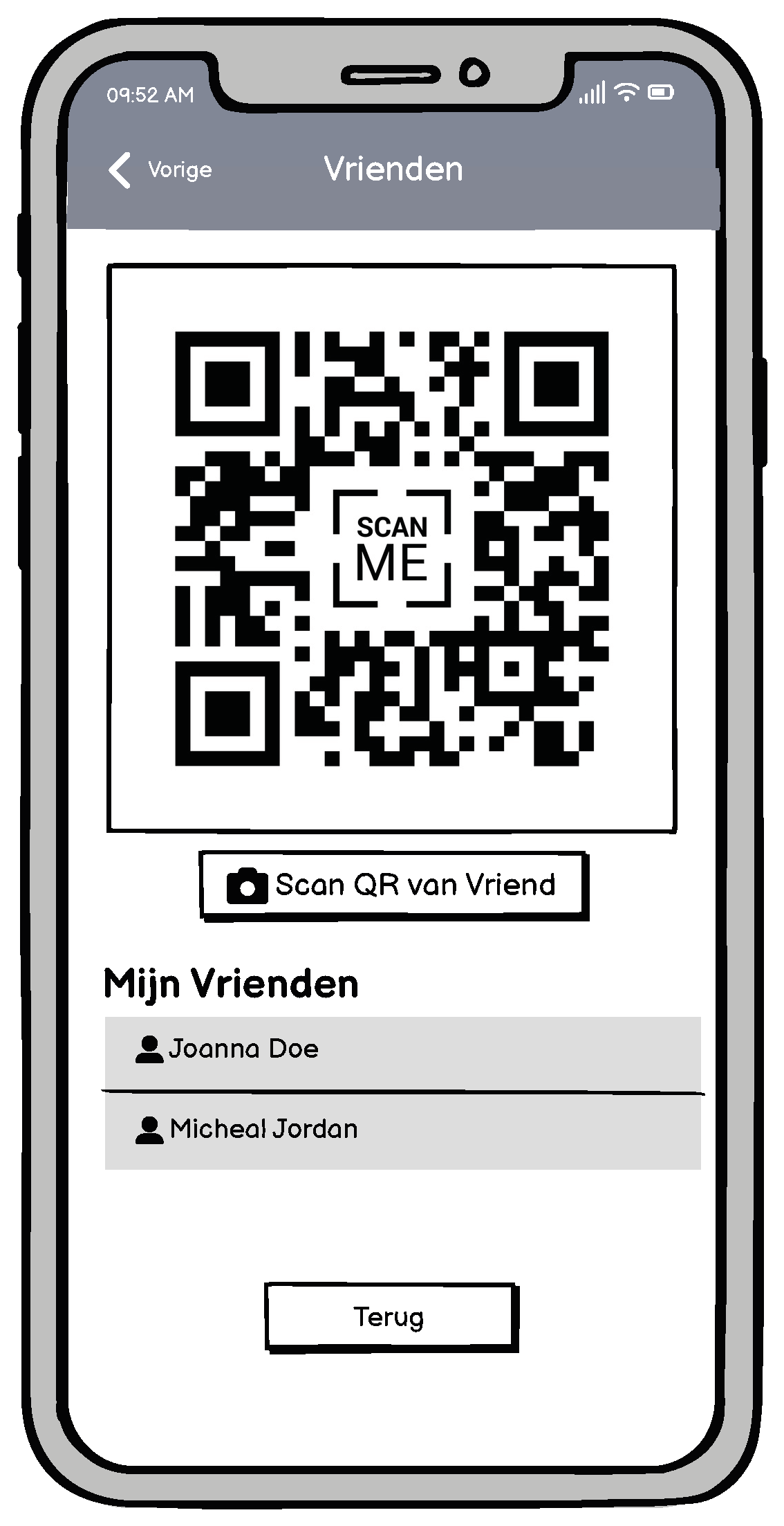
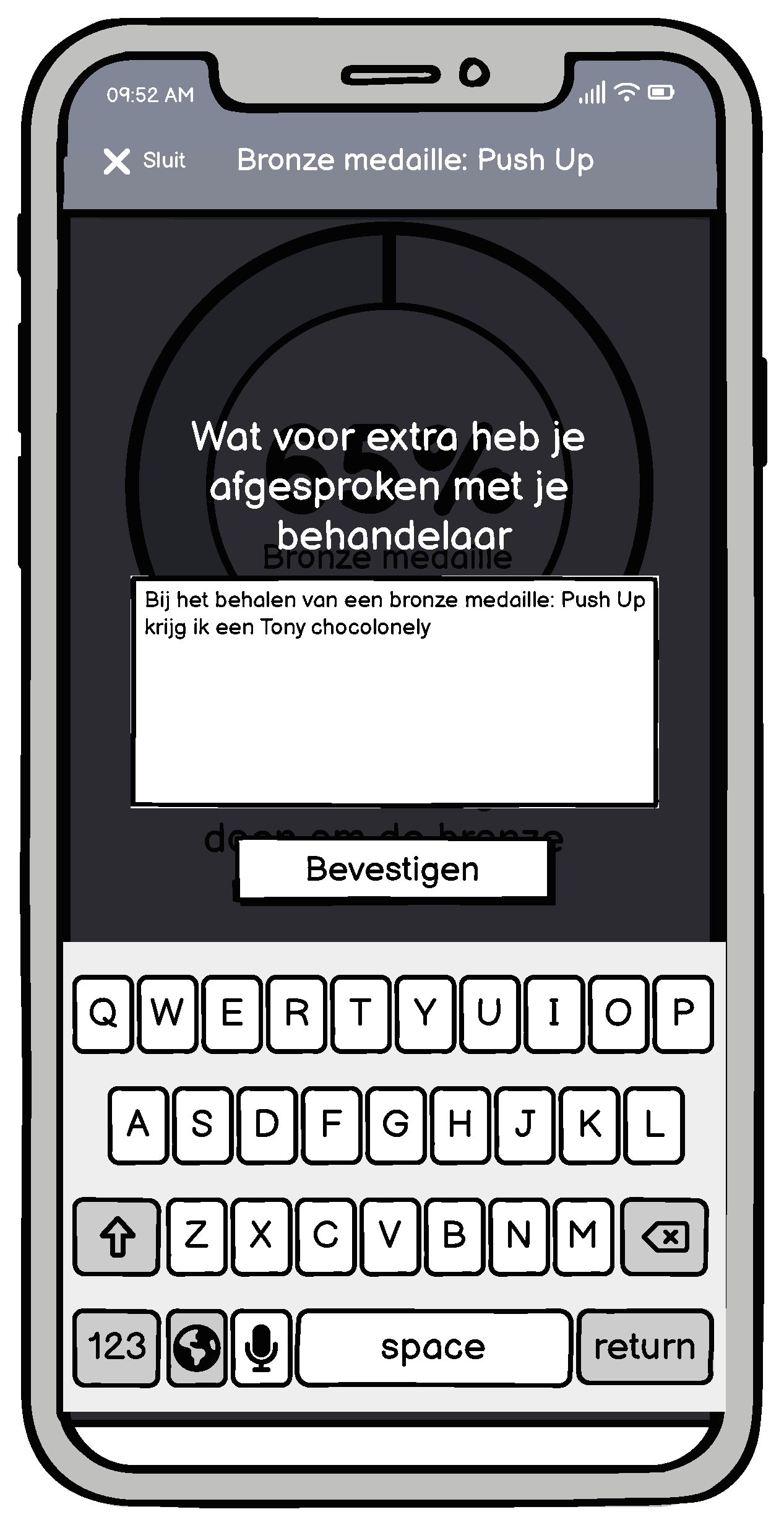
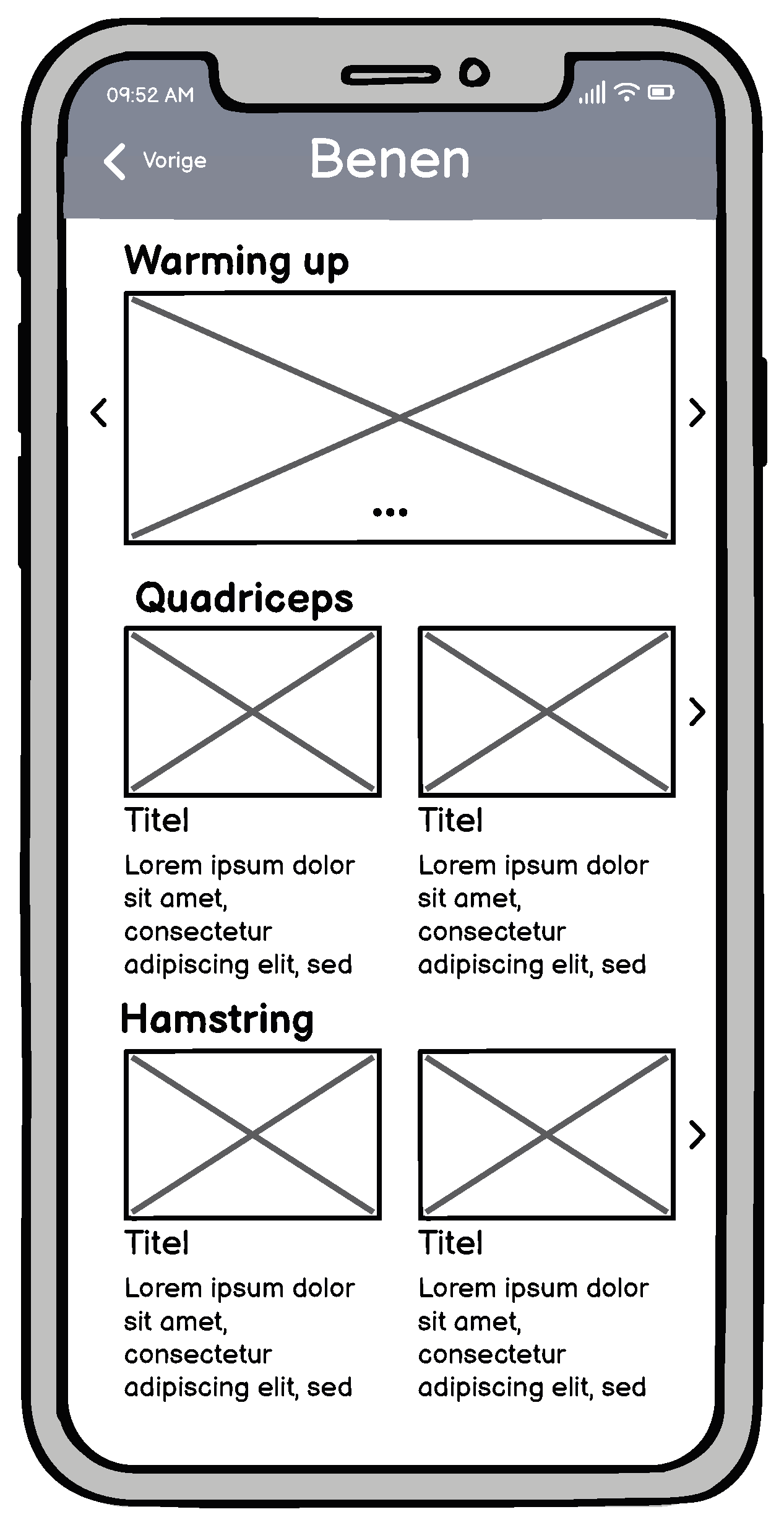
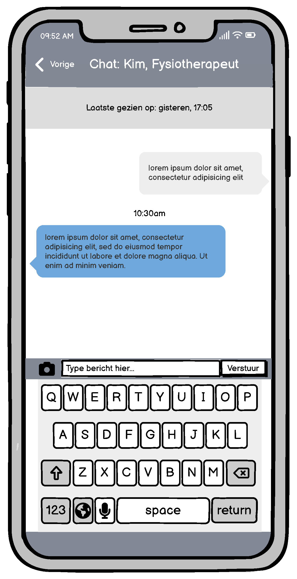
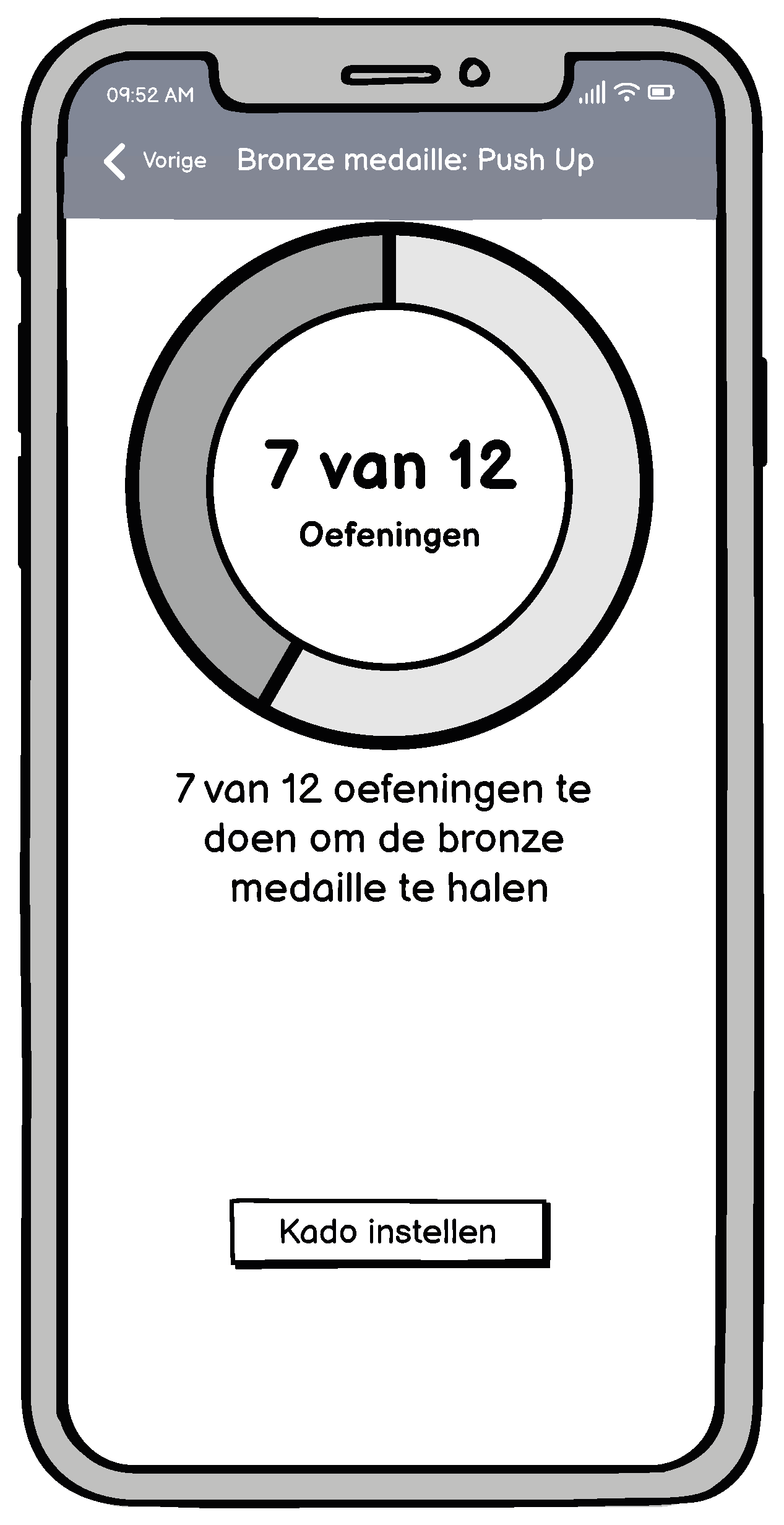
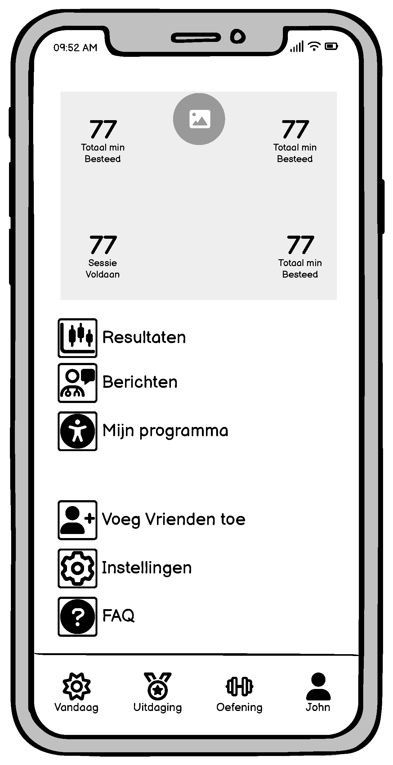
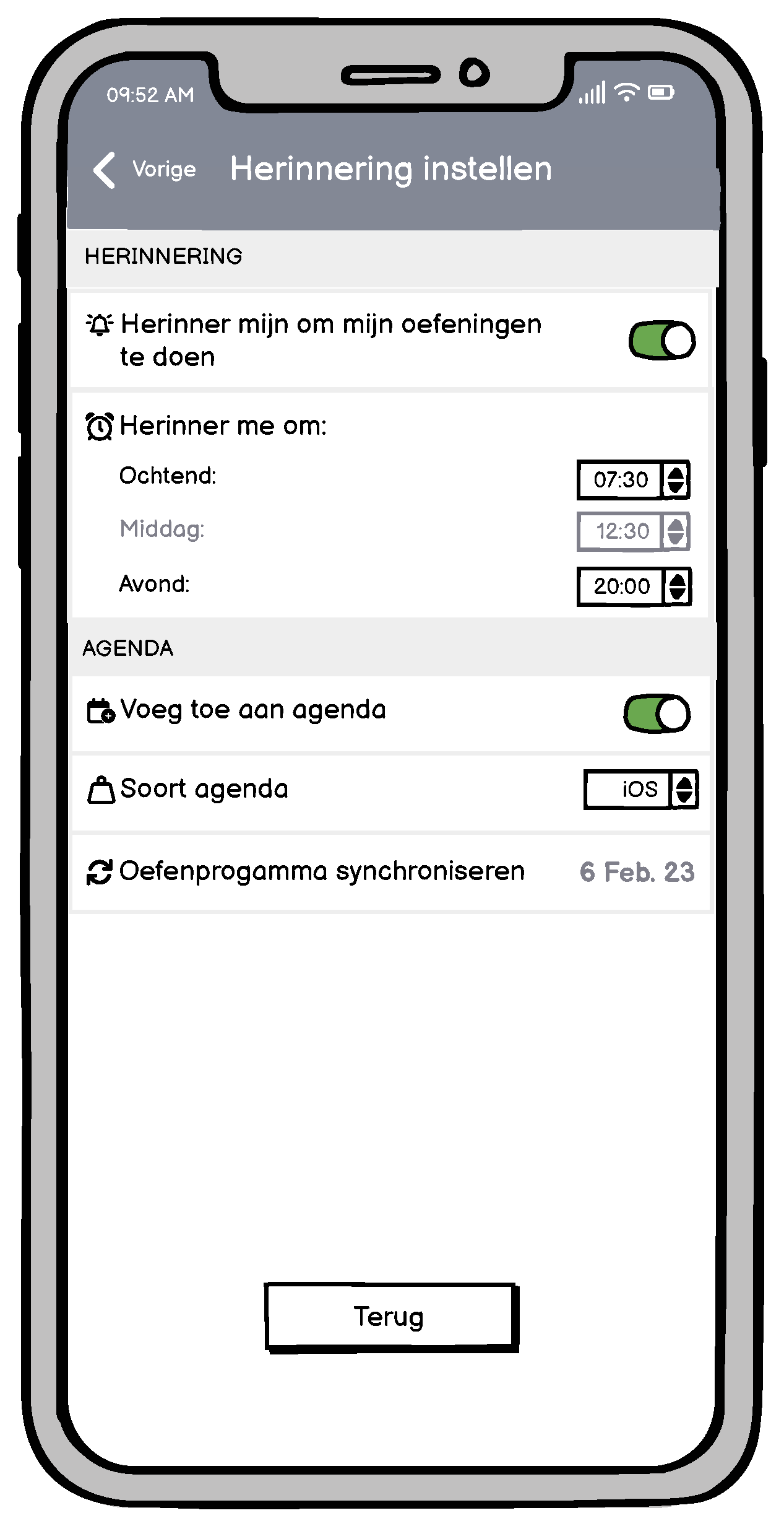
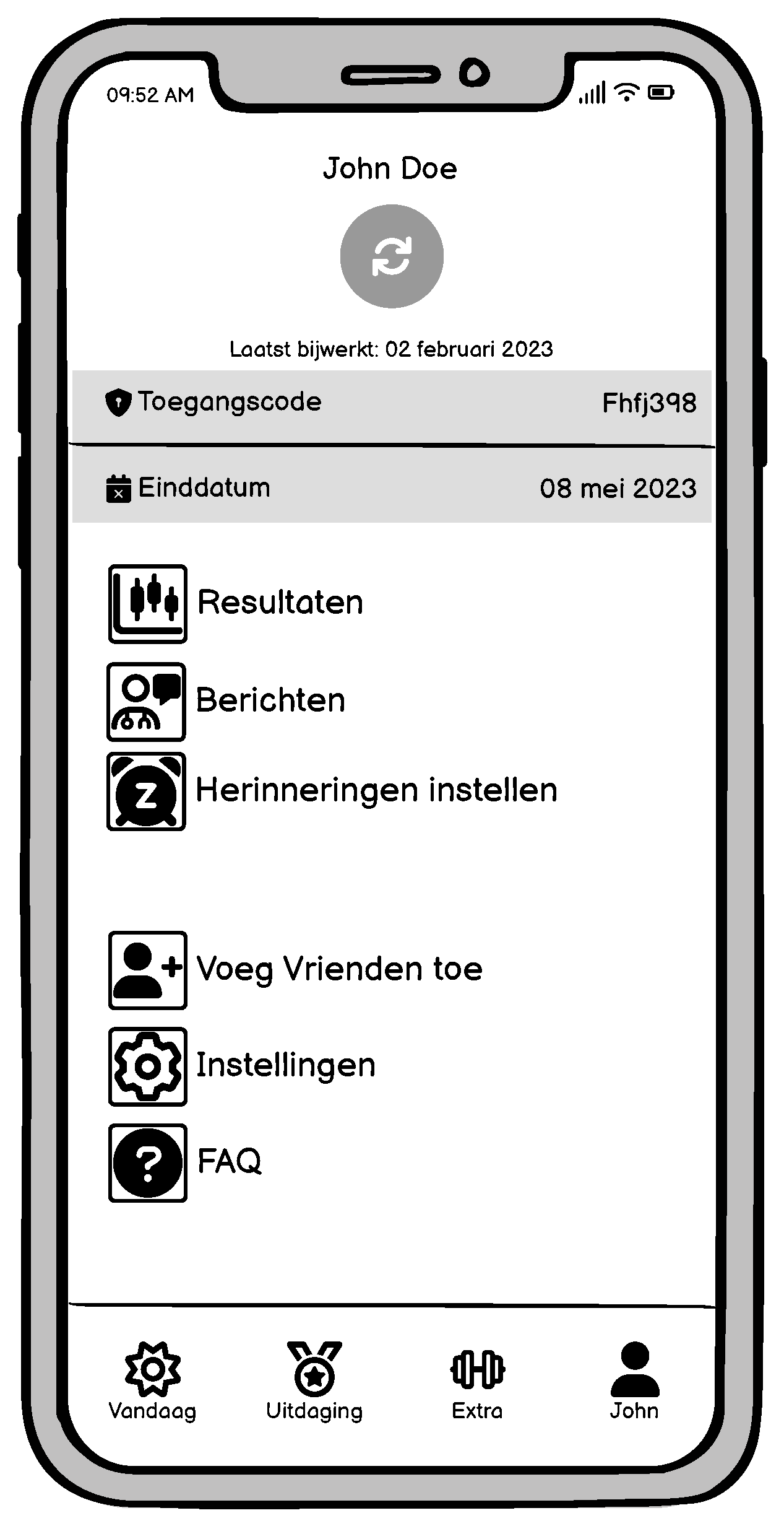
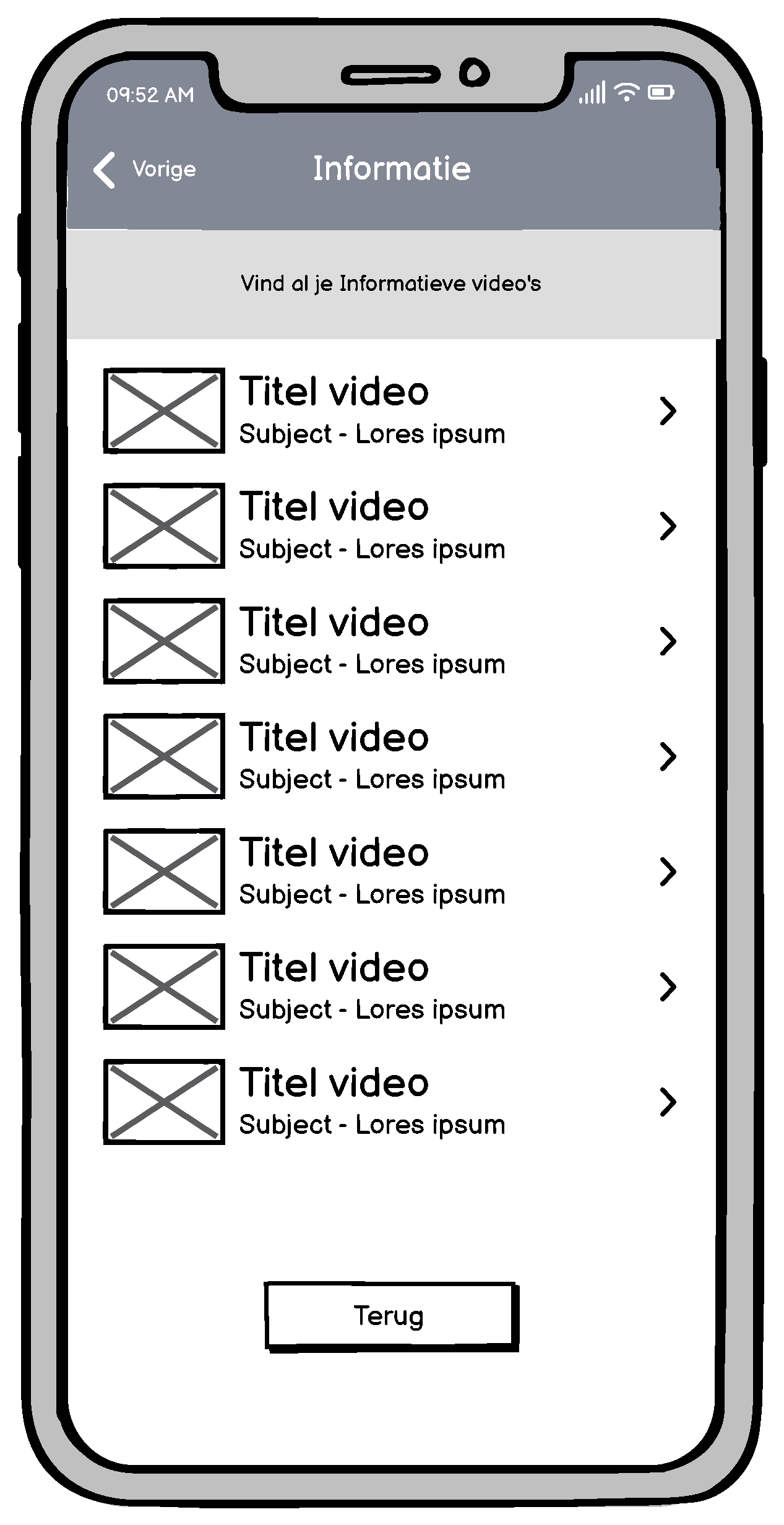
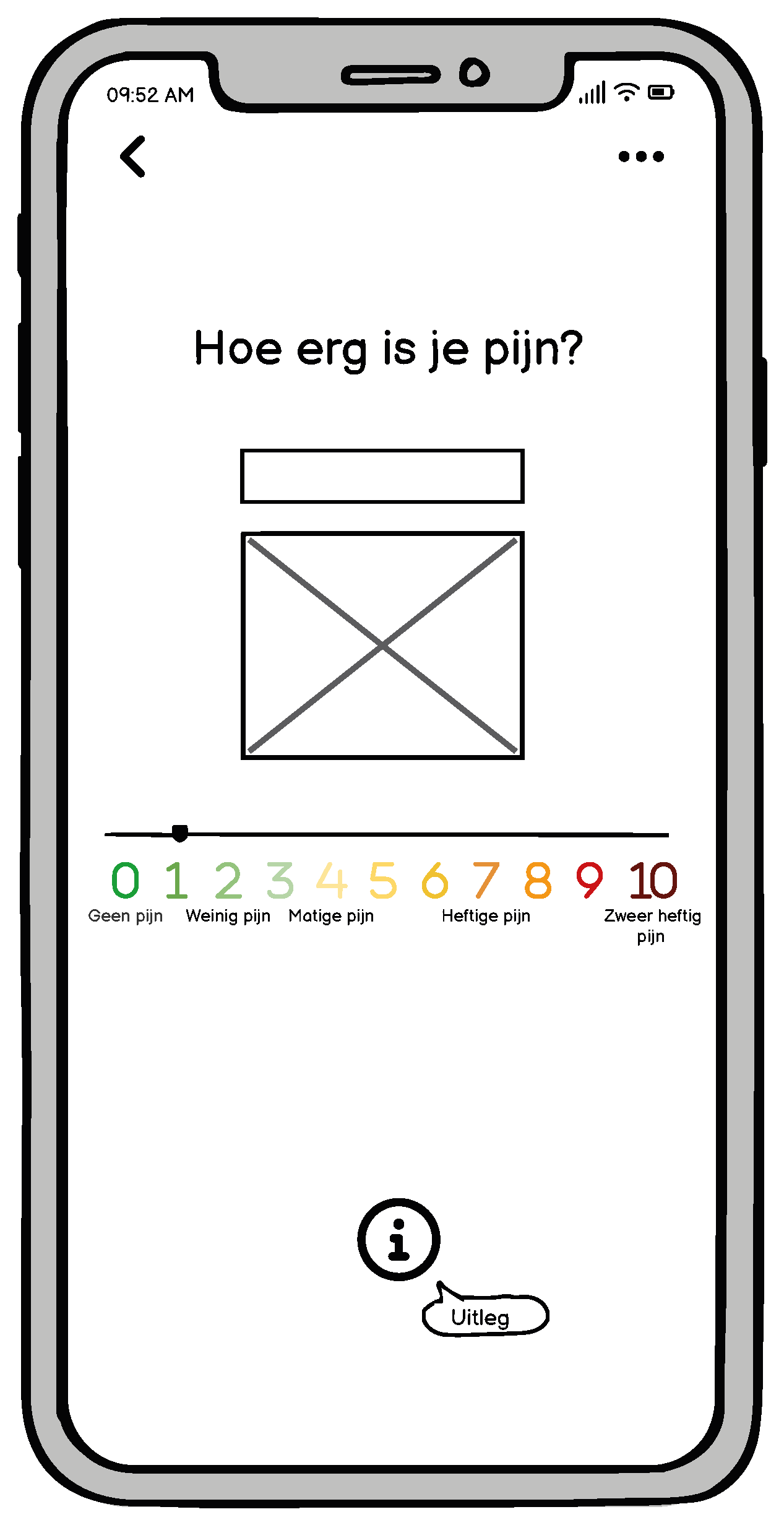
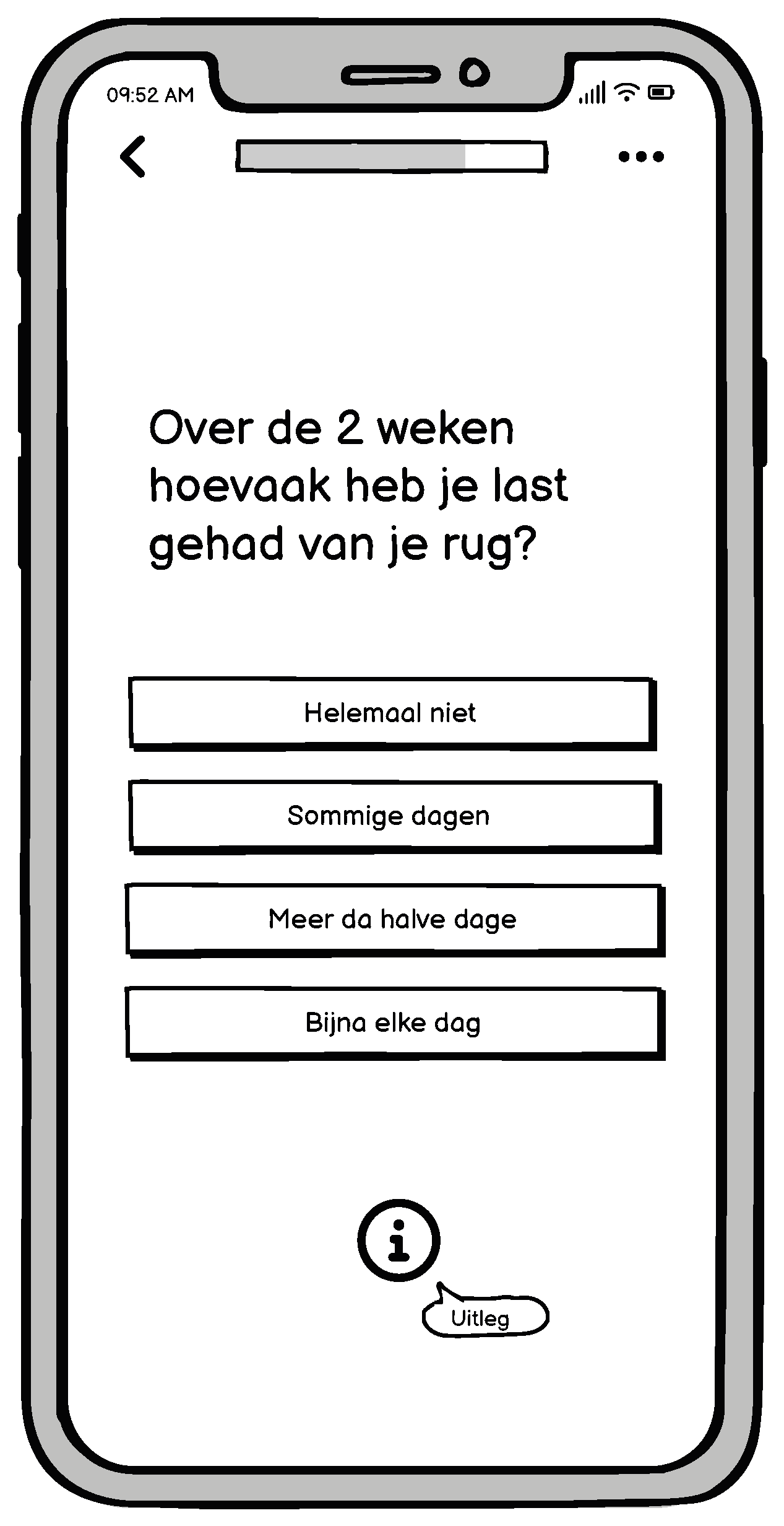
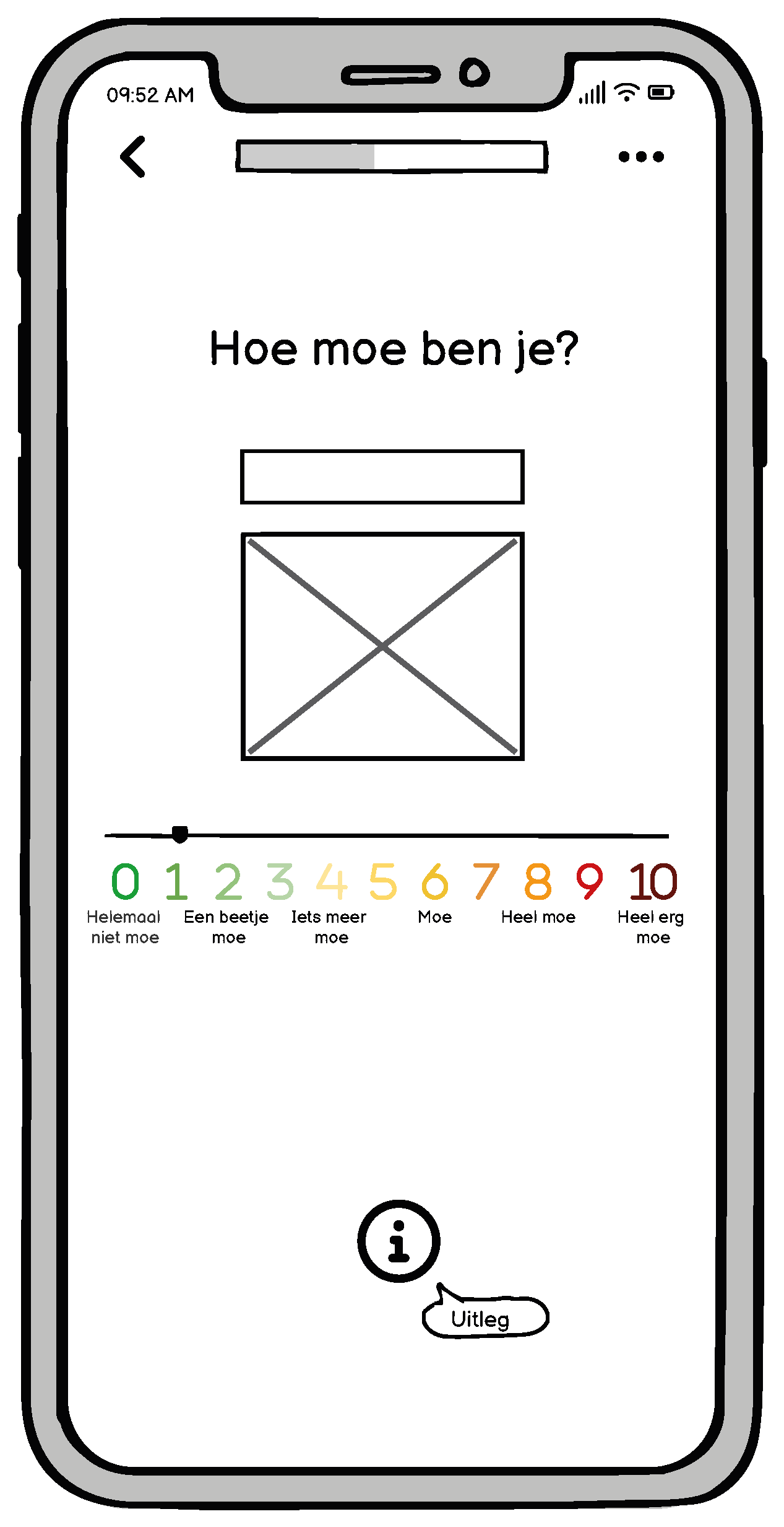
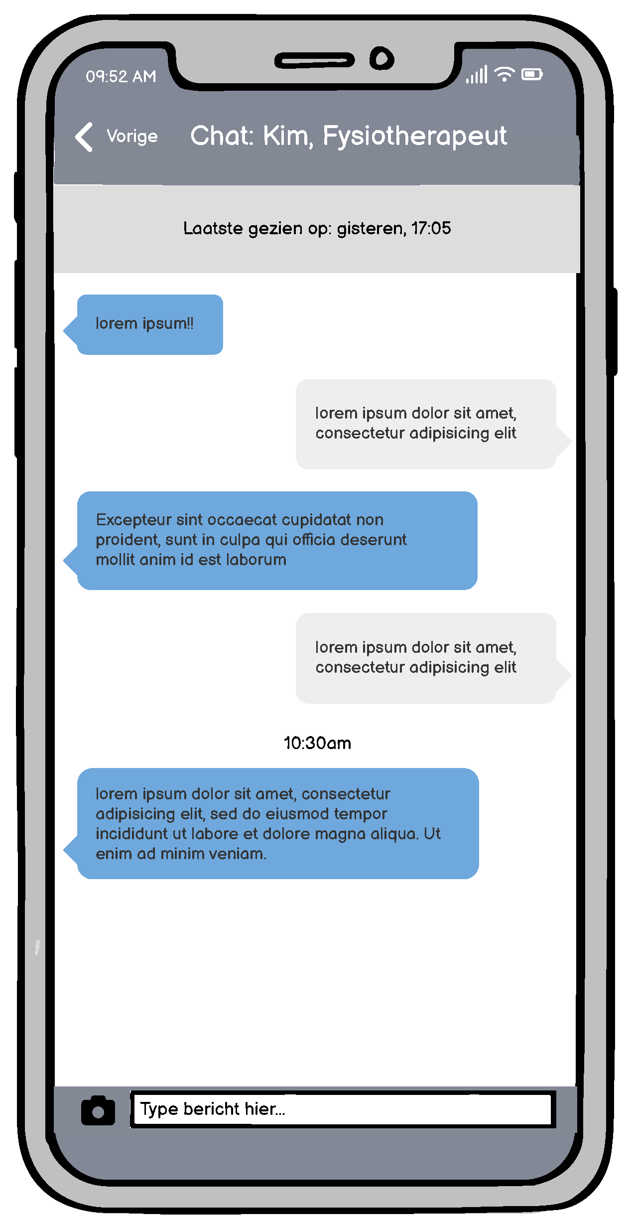
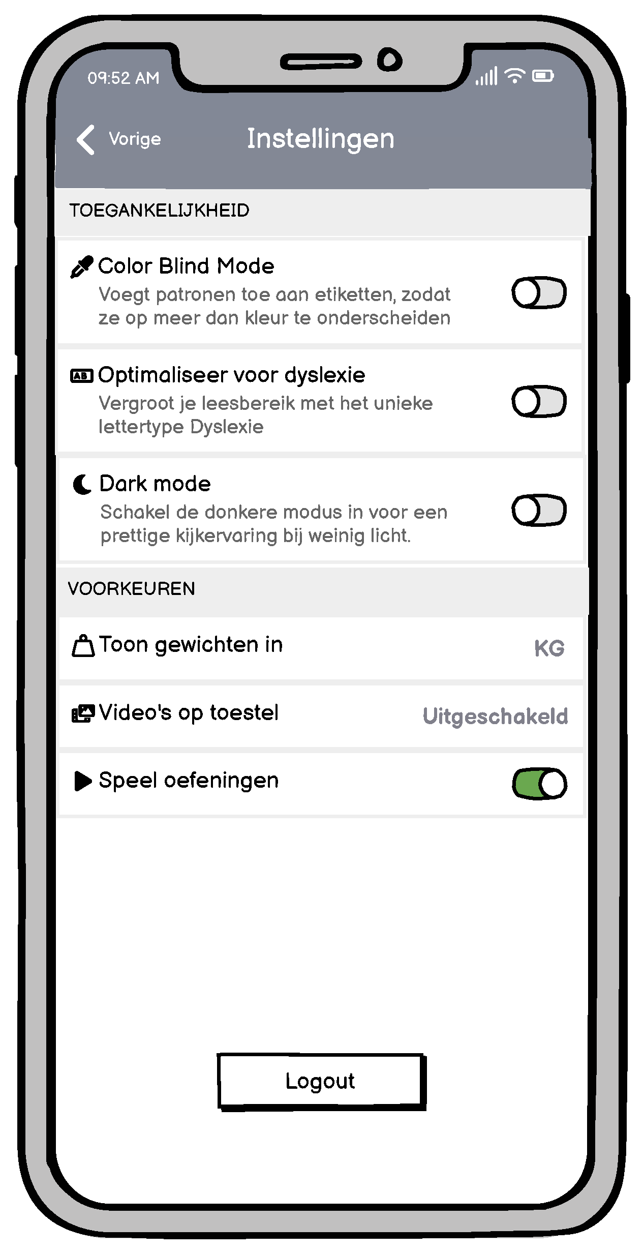
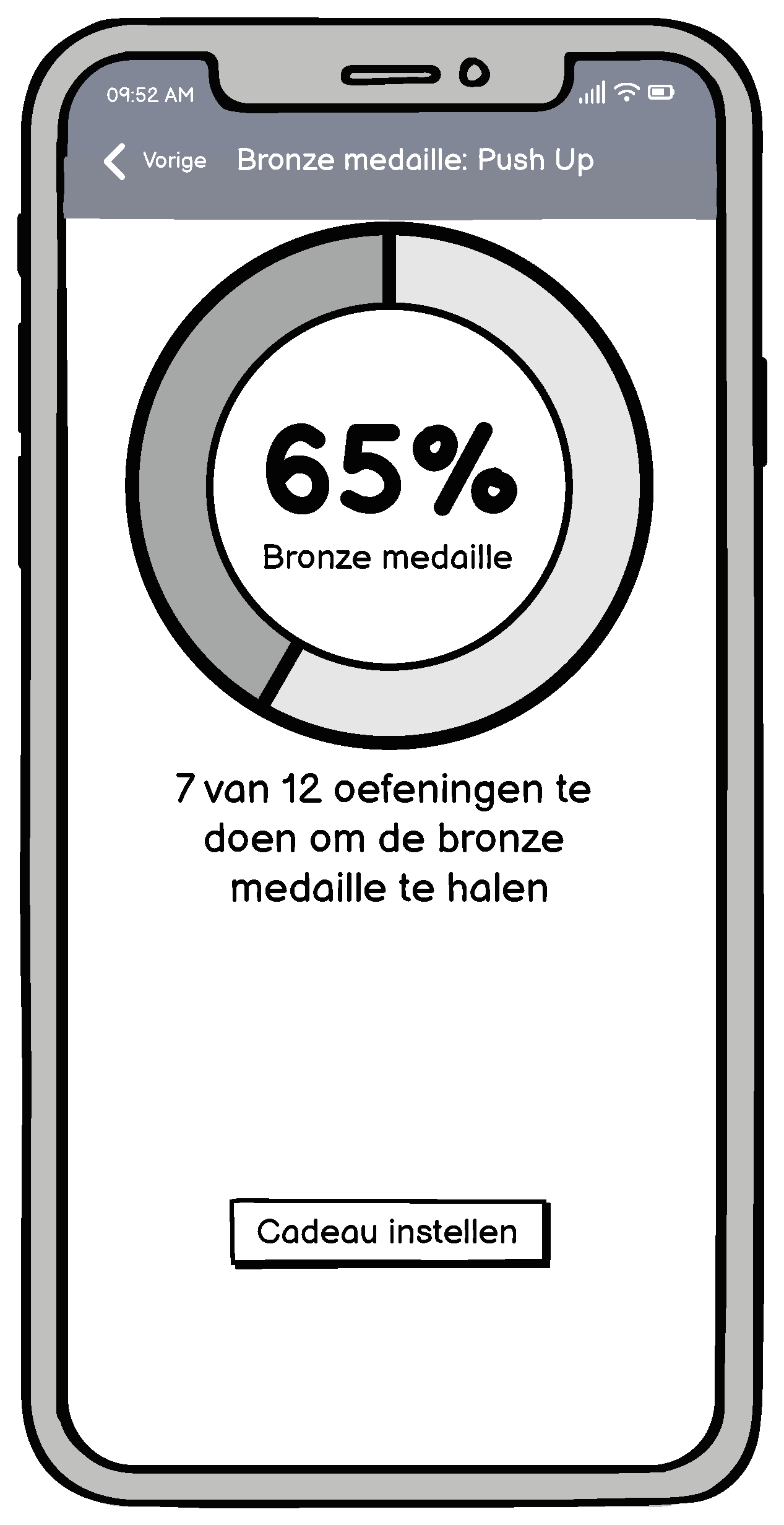
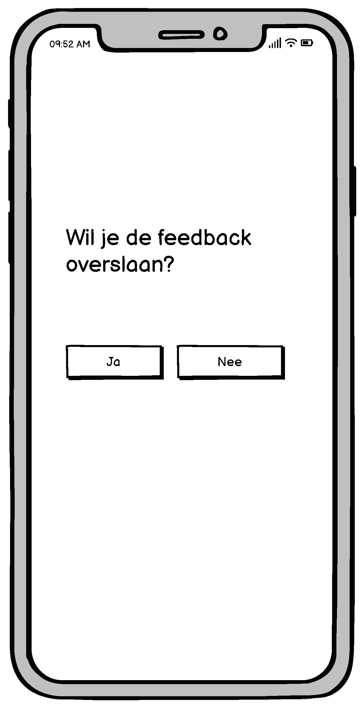
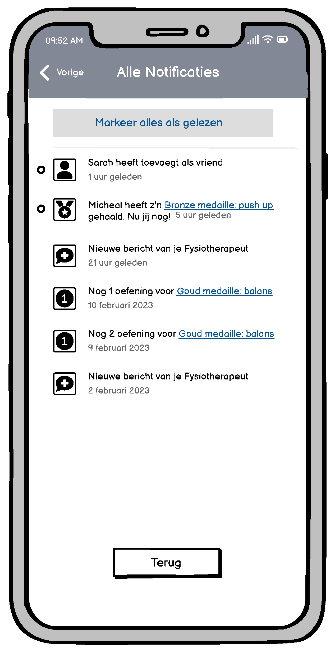
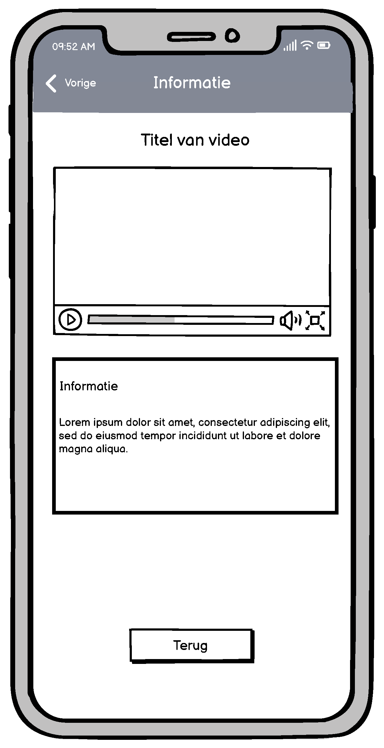
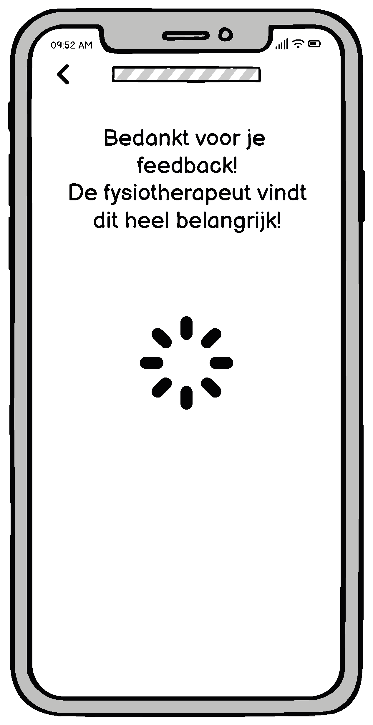
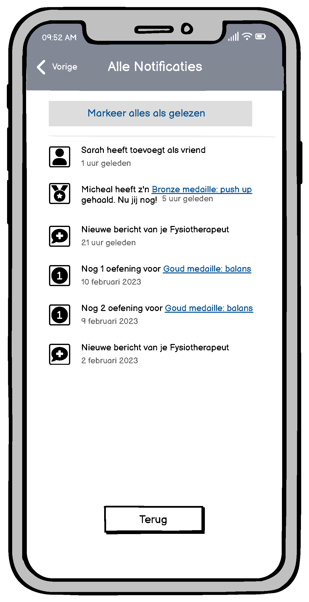
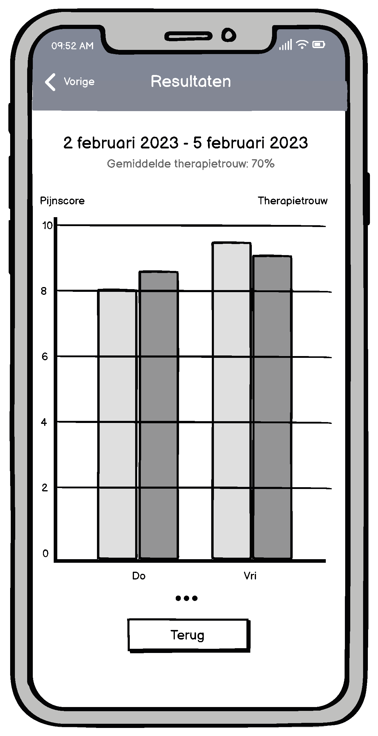
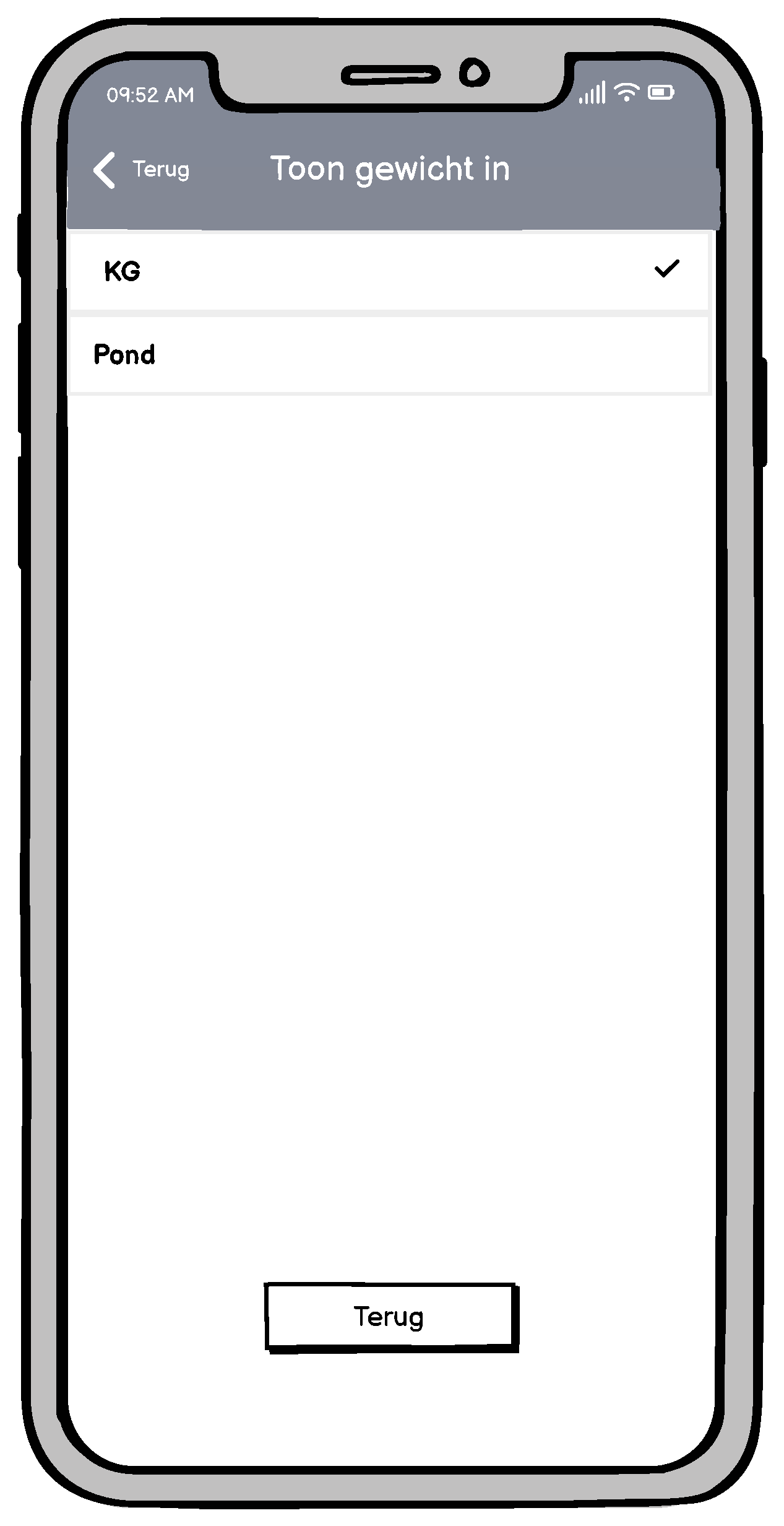
After defining the system requirements, I proceeded to create wireframes based on the final sketches from the co-creation session. Wireframes are schematic and structured visual representations of an app or software program. They serve as a blueprint for the user interface, providing all stakeholders with a clear understanding of the intended structure and functionality of the product before visual design and styling are applied.
To identify and resolve any misunderstandings or user errors and to gain confirmation from the target audience, I tested the concept using the wireframes. These tests included all potential interactions and functionalities.
The wireframes were created using Balsamiq and exported as PDF files. These PDF files included embedded hyperlinks, allowing click behavior to be recorded during tests conducted on mobile devices.
By utilizing wireframes and conducting tests, I was able to further optimize the user experience and ensure an intuitive and well-functioning application.





Usability Testing
Using wireframes and conducting usability tests allowed me to further optimize the user experience and ensure an intuitive, well-functioning application.
For the usability test, we opted for a scenario-based approach, as not all elements in the prototype were interactive.
I followed the guidelines of Quesenbery's 5Es during the testing process.
Positive Findings:
- Participants could complete the daily exercises without any issues and found the muscle information helpful.
- Setting rewards for earned medals was understood and successfully executed.
- Personal settings were easily accessible and intuitive.
Overall, participants gave high ratings for the visual design and the redesign, ranging from 8 to 9 out of 10
Improvement Areas:
- Replace the "information" category with weekly challenges, as suggested by multiple participants.
- Provide users with more freedom to give feedback, for example, by allowing them to submit feedback after completing a timer.
- Modify the start button from a checkmark to a clearer "start" or "pause" button.
- Populate shelves with earned medals, as proposed by one participant.
- Consider removing the streak feature, as not all patients are required to perform exercises daily.
These findings helped us implement targeted improvements, aligning the application more closely with the users' needs and preferences.
Styletile
The motivation for creating the styletile stemmed from the conclusion in the research report that the current appearance of PhysiApp looked too clinical. With the approval of the client, it was decided to deviate from the existing design guidelines to ensure the styletile contributes to a more appealing and less clinical look for the application.
The styletile was approved during the weekly meeting.

Notifications
Using wireframes and conducting usability tests allowed me to further optimize the user experience and ensure an intuitive, well-functioning application.
For the usability test, we opted for a scenario-based approach, as not all elements in the prototype were interactive.
I followed the guidelines of Quesenbery's 5Es during the testing process.
Positive Findings:
- Participants could complete the daily exercises without any issues and found the muscle information helpful.
- Setting rewards for earned medals was understood and successfully executed.
- Personal settings were easily accessible and intuitive.
Overall, participants gave high ratings for the visual design and the redesign, ranging from 8 to 9 out of 10
Improvement Areas:
- Replace the "information" category with weekly challenges, as suggested by multiple participants.
- Provide users with more freedom to give feedback, for example, by allowing them to submit feedback after completing a timer.
- Modify the start button from a checkmark to a clearer "start" or "pause" button.
- Populate shelves with earned medals, as proposed by one participant.
- Consider removing the streak feature, as not all patients are required to perform exercises daily.
These findings helped us implement targeted improvements, aligning the application more closely with the users' needs and preferences.
Make it Real
In the realization phase, I developed a clickable high-fidelity (HI-FI) prototype of the application using Figma. This prototype served as a representation of the final product.
To validate the user experience, I conducted usability tests. These tests provided valuable insights into how well the final product met the users' needs and expectations.
Hi-Fi Prototype
In the realization phase, I developed a clickable high-fidelity (HI-FI) prototype of the application using Figma. This prototype served as a representation of the final product.
To validate the user experience, I conducted usability tests. These tests provided valuable insights into how well the final product met the users' needs and expectations.
Reflection
Lessons Learned from the this project
During this project, I acquired various new hard skills, soft skills, and design practices that contributed to my growth as a designer.
Hard Skills
- Wireframe Tools: I developed proficiency in using tools like Balsamiq and Figma to create structured visual representations of designs.
- Design Guidelines and Color Theory: I expanded my understanding of design principles and improved my ability to apply color effectively to create a visually engaging user interface.
Hard Skills
- Effective Communication and Collaboration: I learned to communicate and collaborate effectively with both the target audience and the client. Building strong relationships and showing empathy were essential in gathering valuable insights from the teenage target group.
- Constructive Feedback: I improved my ability to receive and incorporate feedback constructively, using it to refine the design through iterative processes.
What's Next?
Personal and Professional Growth
This project significantly enhanced my growth as a designer by giving me hands-on experience with the entire UX design process. It taught me how to think and design from a user-centered perspective, keeping the target audience’s needs and feedback at the core of the process. Additionally, the project strengthened my adaptability, flexibility, and ability to communicate effectively with various stakeholders.
Impact on My Design Approach
Everything I learned during this project has influenced the way I approach design. I am now more aware of the importance of empathy, user-centricity, and flexibility in design. I focus on the iterative process—continuously learning, testing, and improving to create the best possible user experience.
This experience has prepared me to tackle future challenges with confidence and a user-focused mindset, ensuring my designs are not only functional but also meaningful and impactful.
The redesign of PhysiApp for teenagers, with its focus on effectiveness, efficiency, appeal, and learnability, offers a valuable contribution to Physitrack's planned gamification initiatives for 2023. It is now up to Physitrack to decide whether to fully implement the redesign and share these new functionalities with their users.
By combining the redesign with gamification, Physitrack has the opportunity to further enhance the user experience for teenagers and increase their engagement. I look forward to Physitrack’s decision and the potential impact these combined efforts may have on the app's users.
Selected Works

Mobile connectKoninklijke KPN
Physitrack for teensBasalt
©2025 HENRY BARIMA